
Block Library - Shadcn Templates
31 themes in this category
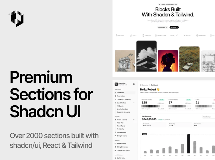
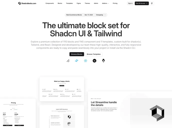
Shadcnblocks
by shadcnblocks
The ultimate block set for shadcn/ui & Tailwind. 1,630 blocks, 1,684 components, and 15 templates for React, Next.js & Astro.
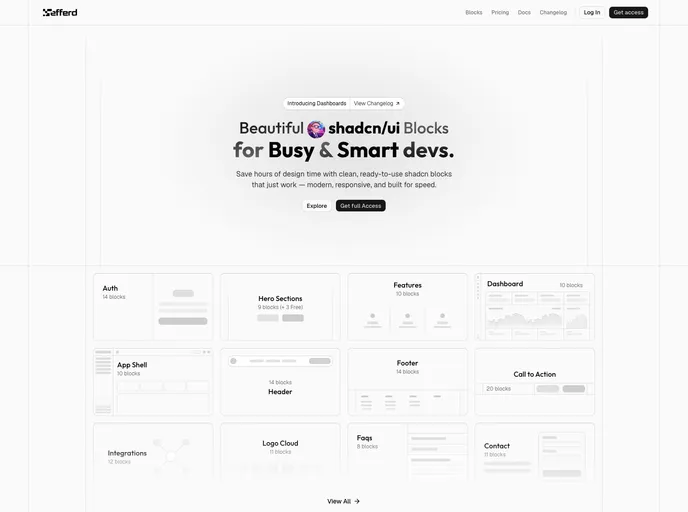
Efferd
by efferd
Ready-to-use shadcn/ui blocks and components — modern, responsive sections installable via the @efferd registry.
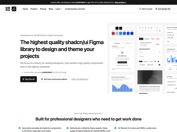
Obra shadcn/ui
by obra
High-quality shadcn/ui Figma library with Nova, Vega, and Luma styles, Pro Blocks, Tailwind 4 colors, Lucide icons, theming, and React Pro Blocks registry.
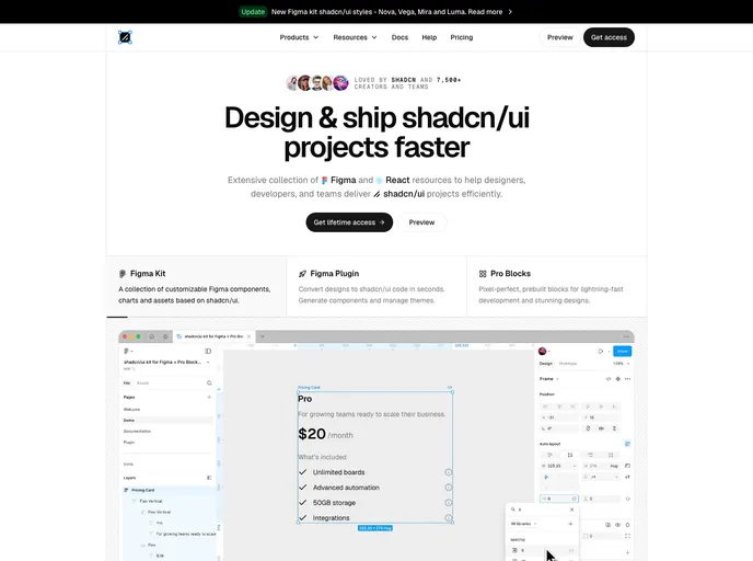
Shadcndesign
by shadcndesign
shadcn/ui kit for Figma with Pro Blocks, templates, a Figma-to-code plugin, and Agent Skills for exporting designs to production-ready React components.
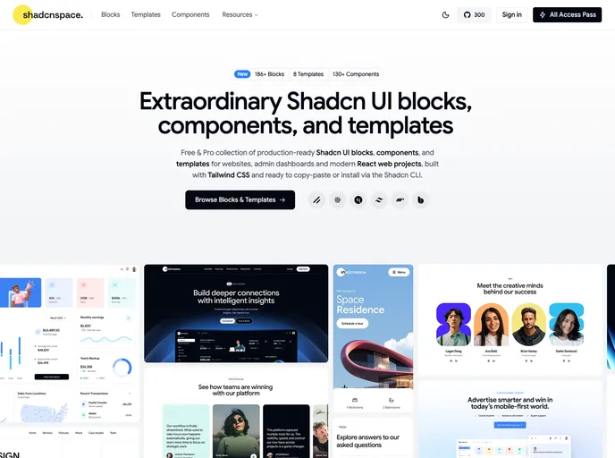
Shadcnspace
by shadcnspace
Open-source shadcn/ui blocks, components, and layouts built with React, Tailwind, and Base UI.
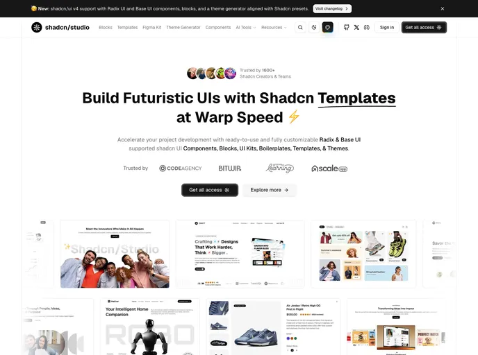
Shadcn Studio
by shadcnstudio
Shadcn Studio is an open-source collection of shadcn/ui components, blocks, and templates designed for developers who are creating modern web applications using React and Next.js.
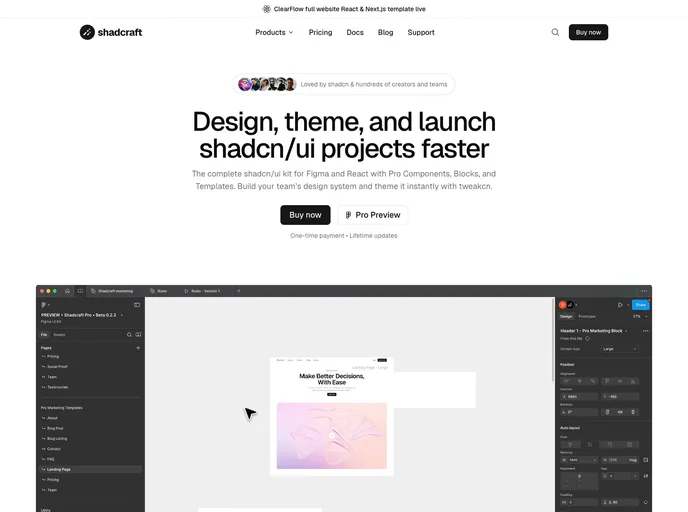
Shadcraft
by Shadcraft
A premium React component library that gives you production-ready shadcn/ui layouts, perfect visual parity with Figma, and fast, scalable builds out of the box.
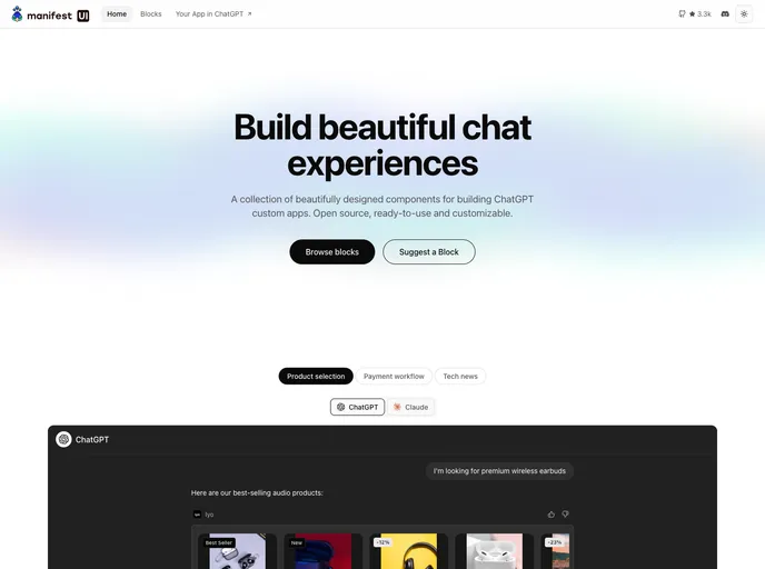
Manifest UI
by manifest
A component library for building ChatGPT Apps and MCP Apps.
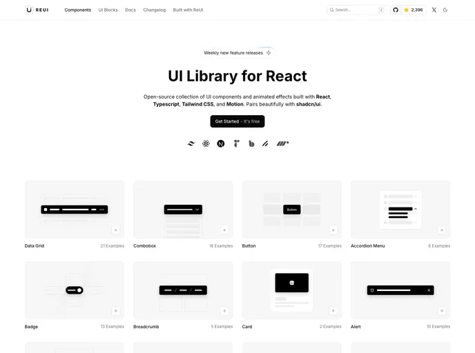
Re-UI
by reui
Open-source collection of UI components and animated effects built with React, TypeScript, Tailwind CSS, and Motion. Pairs beautifully with shadcn/ui.

AI Elements by Vercel
by vercel
AI Elements is a component library and custom registry built on top of shadcn/ui and Vercels AI SDK to help you build AI-native applications faster. It provides pre-built components like conversations, messages and more.
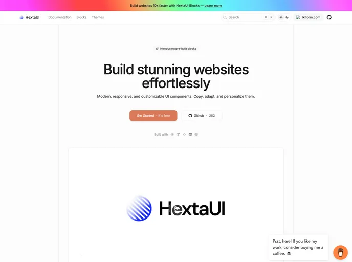
HextaUI
by preetsuthar17
modern, responsive, and customizable ui components.
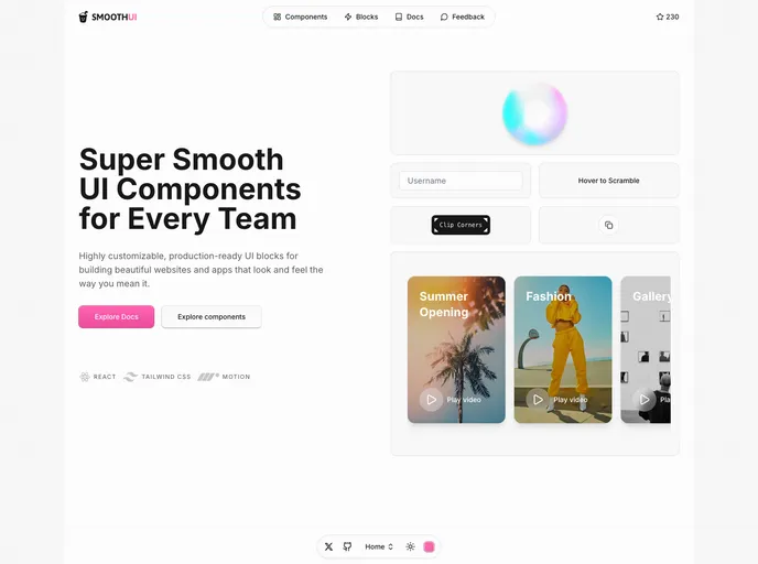
Smooth UI
by educlopez
SmoothUI is a collection of beautifully designed components with smooth animations built with React, Tailwind CSS, and Motion

Blocks.so
by ephraimduncan
An open-source library of UI blocks. Built with React, Tailwind and shadcn/ui

Tailark
by tailark
Shadcn marketing blocks

8bitcn UI
by theorcdev
A set of retro-designed, accessible components and a code distribution platform. Open Source. Open Code.

Aceternity UI
by aceternity
Beautiful Tailwind CSS and Framer Motion components, blocks, and templates. Copy-paste UI with free components and an All-Access Pass for premium blocks.
Shadcnblocks
by shadcnblocks
The ultimate block set for shadcn/ui & Tailwind. 1630 blocks, 1684 components, and 15 templates for React, Next.js & Astro.

Cult UI
by newcult
Cult UI Pro — polished shadcn marketing blocks, components, full-stack patterns, and Next.js SaaS templates. Open-source components on GitHub; lifetime license for blocks, templates, and updates.

Pro Motion Primitives
by ibelick
Motion-Primitives Pro helps you ship websites that feel alive with handcrafted motion components, sections, and templates.

Myna UI
by praveenjuge
TailwindCSS and shadcn/ui UI Kit for Figma and React

Skiper UI
by skiper-ui
Outstanding and unique react and shadcn/ui components. A selection of rare blocks and components.

Prompt Kit
by ibelick
Core building blocks for AI apps. High-quality, accessible, and customizable components for AI interfaces.

Launch UI
by launch-ui
Landing page kit built with React, Shadcn/ui and Tailwind that you can copy/paste into your project.

Spectrum UI
by arihantcodes
Spectrum UI is a collection of re-usable components built using Aceternity UI Magic UI and ShadCN UI that you can copy and paste into your apps.
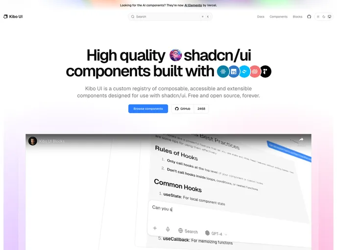
Kibo UI
by haydenbleasel
A custom registry of composable, accessible and open source shadcn/ui components.

Kokonut UI
by kokonut-labs
Collection of components built for Next.js and React with Tailwind CSS and shadcn/ui

UI Layouts
by ui-layouts
100+ Free beautifull interactive react/nextjs component based on tailwindcss, framer-motion, gsap etc

Simple AI
by simple-ai
Components and blocks to easily build AI apps. A collection of ready-to-use UI components designed specifically for AI-powered applications.

Motion Primitives
by ibelick
UI kit to make beautiful, animated interfaces, faster. Customizable. Open Source.

Eldora UI
by karthikmudunuri
Eldora UI is a collection of re-usable components that you can copy and paste into your web apps. It primarily features components, blocks, and templates.
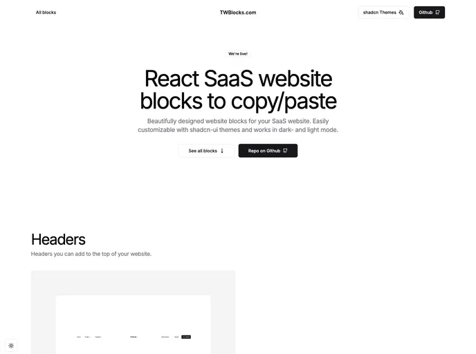
TWBlocks
by tommyjepsen
Website blocks to copy/paste - based on shadcn & Radix using Tailwind and NextJS

Magic UI
by magicuidesign
UI library for design engineers — animated components and effects to copy and paste, plus 50+ premium sections and templates with Framer Motion.