
UI Kits & Components - Shadcn Templates
47 themes in this category

Shadcn UI
by shadcn-ui
shadcn/ui is a collection of beautifully designed, accessible, and customizable UI components for React, built on top of Radix UI and styled with Tailwind CSS. Shadcn revolutionized UI libraries with a copy-paste model, giving developers full control without dependencies. Its component registry l...
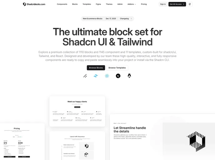
Shadcnblocks
by shadcnblocks
The ultimate block set for shadcn/ui & Tailwind. 1110+ blocks, 1145+ components, and 11 templates for React, Next.js & Astro.

Magic UI
by magicuidesign
UI Library for Design Engineers. Animated components and effects you can copy and paste into your apps. Free. Open Source.

Aceternity UI
by aceternity
Popular copy/paste React and tailwind component library.

Skiper UI
by skiper-ui
Outstanding and unique react and shadcn/ui components. A selection of rare blocks and components.

Prompt Kit
by ibelick
Core building blocks for AI apps. High-quality, accessible, and customizable components for AI interfaces.

Tailark Blocks
by tailark
Shadcn marketing blocks
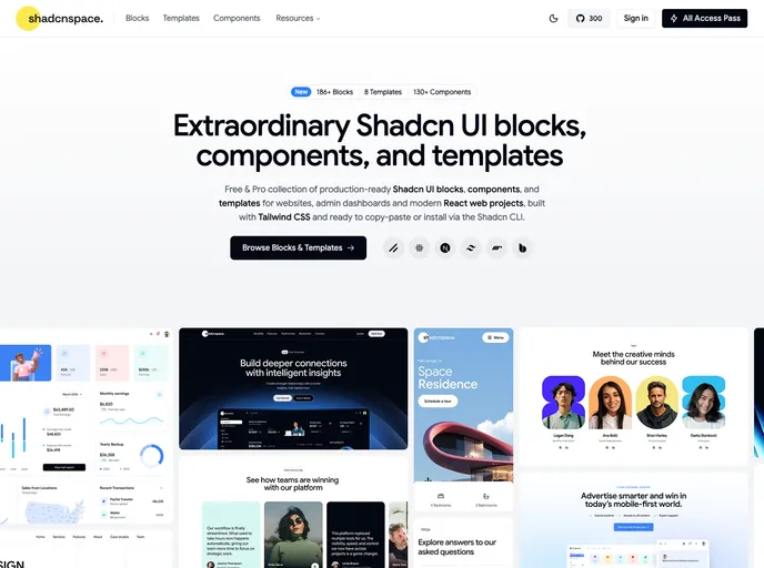
Shadcnspace
by shadcnspace
Open-source shadcn/ui blocks, components, and layouts built with React, Tailwind, and Base UI.
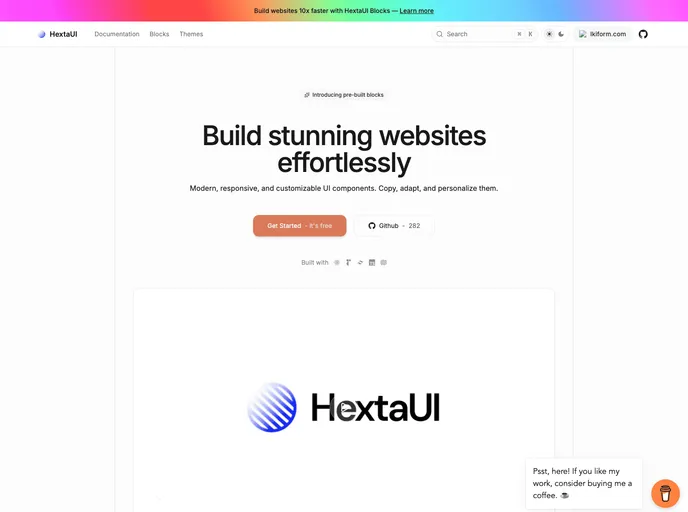
HextaUI
by preetsuthar17
modern, responsive, and customizable ui components.

Radix UI
by radix-ui
Radix Primitives is an open-source UI component library for building high-quality, accessible design systems and web apps. Maintained by @workos.

Spectrum UI
by arihantcodes
Spectrum UI is a collection of re-usable components built using Aceternity UI Magic UI and ShadCN UI that you can copy and paste into your apps.

Myna UI
by praveenjuge
TailwindCSS and shadcn/ui UI Kit for Figma and React

Aceternity UI Pro
by aceternity
Amazing premium UI Kit & templates for Tailwind, Nextjs, and React.

Pro Motion Primitives
by ibelick
Motion-Primitives Pro helps you ship websites that feel alive with handcrafted motion components, sections, and templates.

Magic UI Pro
by magicuidesign
50+ beautiful sections and templates built with React, Typescript, Tailwind CSS, and Framer Motion.

Pro version of Cult UI - Blocks and components built with React, Typescript, Tailwind CSS, and Motion

Tremor
by tremorlabs
Copy & Paste React components to build modern web applications.

Motion Primitives
by ibelick
UI kit to make beautiful, animated interfaces, faster. Customizable. Open Source.

Neobrutalism Components
by ekmas
A collection of neobrutalism-styled Tailwind components.
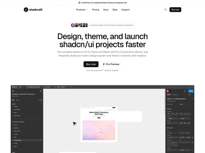
Shadcraft
by Shadcraft
A premium React component library that gives you production-ready shadcn/ui layouts, perfect visual parity with Figma, and fast, scalable builds out of the box.
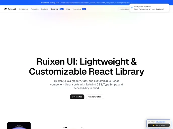
Ruixen UI
by ruixenui
Ruixen UI is a lightweight and customizable React component library. Build beautiful interfaces with minimal overhead.

Shadcn Vue
by unovue
Vue port of shadcn-ui
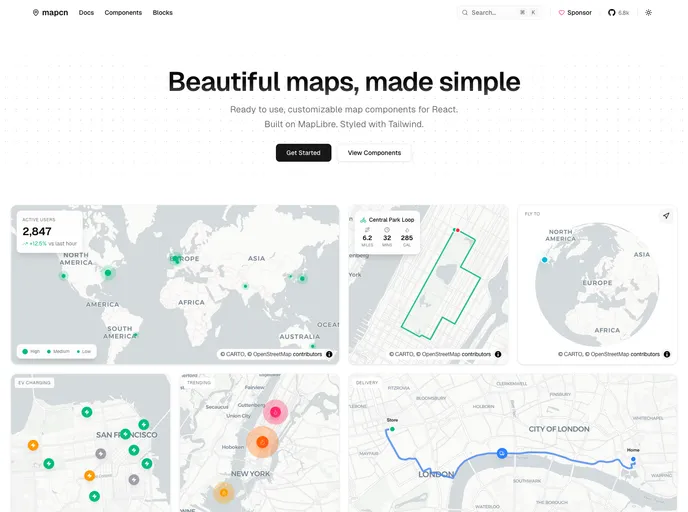
Mapcn
by AnmolSaini16
Mapcn is a collection of beautiful map components designed for developers who require dynamic mapping solutions in their applications.

Assistant UI
by assistant-ui
Typescript/React Library for AI Chat

Inspira UI
by unovue
Build beautiful website using Vue & Nuxt.

UI Layouts
by ui-layouts
100+ Free beautifull interactive react/nextjs component based on tailwindcss, framer-motion, gsap etc

Intent UI
by irsyadadl
Intent UI is a chill set of React components, built on top of React Aria Components and Tailwind CSS. Easy to customize and just copy & paste into your React projects.

Eldora UI
by karthikmudunuri
Eldora UI is a collection of re-usable components that you can copy and paste into your web apps. It primarily features components, blocks, and templates.

Page UI
by danmindru
Landing page UI components for React & Next.js, built on top of TailwindCSS

Solid UI
by stefan-karger
Beautifully designed components. Built with Kobalte & corvu. Styled with Tailwind CSS.

Sera UI
by seraui
A helpful UI library for design engineers. Use cool animations and components with just a copy and paste. Free and open source

RetroUI
by logging-stuff
A retro-styled UI library for modern web applications.

Shadcn Flutter
by sunarya-thito
Shadcn/UI ported to Flutter (Unofficial)
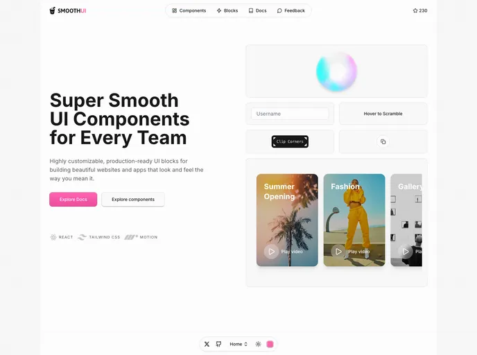
Smooth UI
by educlopez
SmoothUI is a collection of beautifully designed components with smooth animations built with React, Tailwind CSS, and Motion
Forgeui
by AmanShakya0018
A library of React components for smooth, fast front-end development.
Native UI
by nativeui-org
A set of beautifully-designed, accessible React Native components distributed via the shadcn registry. Works with Expo and your favorite tools. Open Source.

View Shadcn UI
by devlive-community
View Shadcn UI 是一个基于 Tailwind CSS 构建的 Vue3 组件库。

Zard UI
by zard-ui
A collection of beautiful and accessible components for Angular based in Shadcn/ui and Ng-zorro. Fully open source and free

NativeCN
by tailwiinder
A React Native UI component library inspired by shadcn/ui. Get beautiful, accessible UI components for your React Native apps by copying and pasting code.
Satisui
by satisui
Satisui is a comprehensive UI kit designed for developers utilizing shadcn/ui, offering a collection of beautifully engineered components aimed at streamlining the development process.
Re-UI
by reui
Open-source collection of UI components and animated effects built with React, TypeScript, Tailwind CSS, and Motion. Pairs beautifully with shadcn/ui.
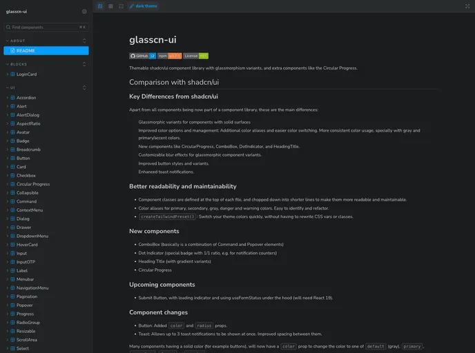
Glasscn UI
by itsjavi
shadcn/ui component library with glassmorphism variants, and many additional components. Beautiful frosted glass effects for modern UIs.

Shuffle UI Kit Bundle
by shuffle
Incredible ui kits for Tailwind, Bootstrap & Shadcn/UI.

Shaduxe UI
by shaduxe
Component variants for shadcn/ui. Extend your shadcn/ui components with additional variants and styles.

Gluestack UI
by gluestack
React & React Native Components with Tailwind CSS. Universal components that work across web and mobile platforms.
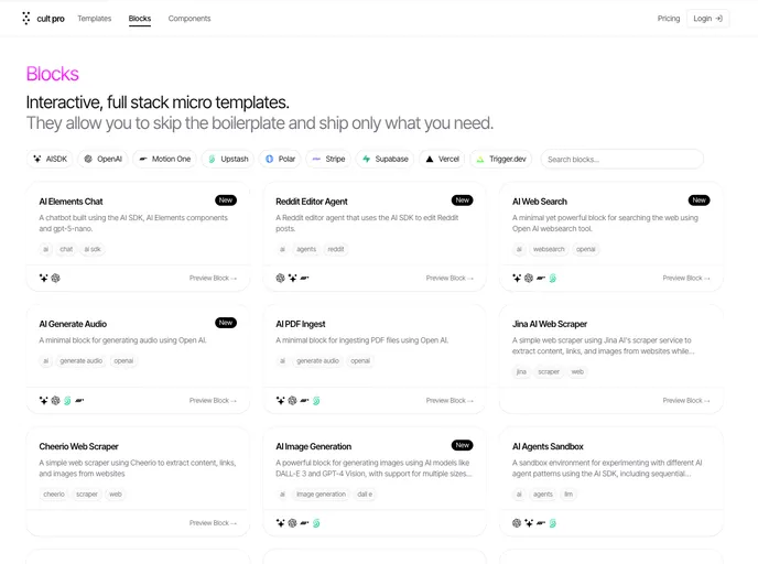
Cult Pro Blocks
by newcult
A powerful set of fullstack templates for Nextjs, Tailwind & Shadcn

Shadcn Charts
by shadcn-ui
Shadcn UI official chart library built with Recharts. Copy / Paste component library.