


 approvals-ui
Approvals UI
Approval workflow components for React Flow: quorum gates, amount thresholds, a policy lint (segregation of duties, single approver on high value), and plain-language editing behind a human review gate.
- Free
- Price
- Jul 13, 2026
- Listed
 Open Approvals UI
Overview
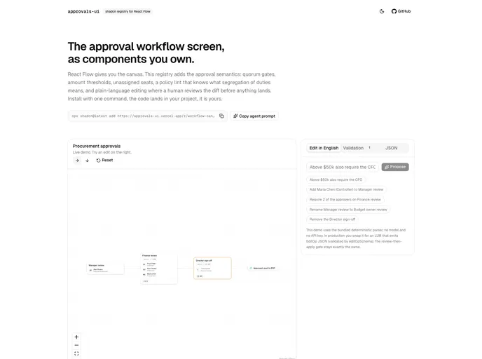
approvals-ui is a shadcn-style registry of React Flow components for approval workflow screens, built by Dylan Mérigaud and extracted from ledgerloop, where an agent builds this screen from a client's HRIS. React Flow supplies the canvas; approvals-ui adds the approval semantics on top: quorum gates, amount thresholds, unassigned seats and a policy lint.
Plain-language editing is gated by human review. A user proposes a change such as "Above $50k also require the CFO", reviews the diff on the canvas, and then applies or discards it. The demo uses a bundled deterministic parser with no model or API key; in production, an LLM can emit EditOp JSON validated by a Zod schema. The registry has six MIT-licensed items.
Features
- workflow-canvas: The whole screen in one component, taking policy JSON in and rendering an auto-laid-out graph.
- nl-edit-panel: Propose plain-language edits, review the diff on the canvas, then apply or discard.
- validation-panel: Structural errors and best-practice warnings such as segregation of duties and single approvers on high-value steps.
- approval-node: Gate cards with approvers, unassigned seats, quorum badge, condition pill, SLA and diff rings.
- terminal-node: Approved and rejected outcome pills.
- approvals-core: A headless core with the Zod policy schema, validation rules, step diff and deterministic edit ops.
Tech stack
- React, React Flow (@xyflow/react)
- Zod
- dagre, react-flow-auto-layout
- lucide-react
Registry
Install via the shadcn CLI registry:
npx shadcn@latest add @approvals-ui/component-name







