


Shadcn Figma8 listings
This collection lists Figma kits built to match shadcn/ui: component libraries with variables mapped to shadcn theme tokens, light and dark modes, and in many cases pro blocks that have matching code. They help designers and developers work from the same structure so handoff produces fewer surprises.
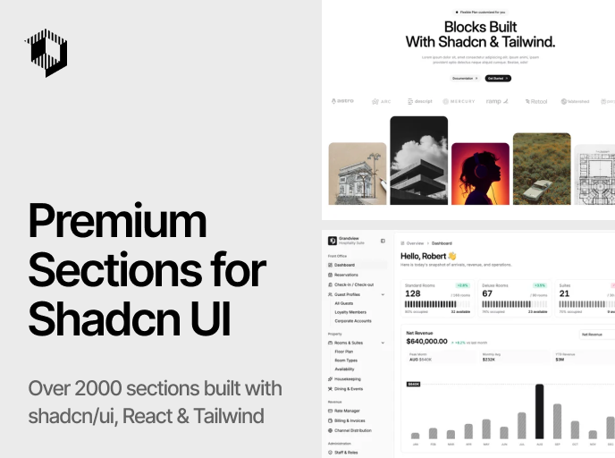

Shadcnblocks
The ultimate block set for shadcn/ui & Tailwind. 1,630 blocks, 1,684 components, and 15 templates for React, Next.js & Astro.
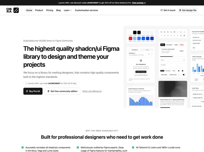

Obra shadcn/ui
High-quality shadcn/ui Figma library with Nova, Vega, and Luma styles, Pro Blocks, Tailwind 4 colors, Lucide icons, theming, and React Pro Blocks registry.

Shadcncraft Figma Kit
Complete shadcn/ui Figma kit with all seven native shadcn styles, shadcn Create and tweakcn imports, style-linked icons, and 1:1 parity with shadcn code.
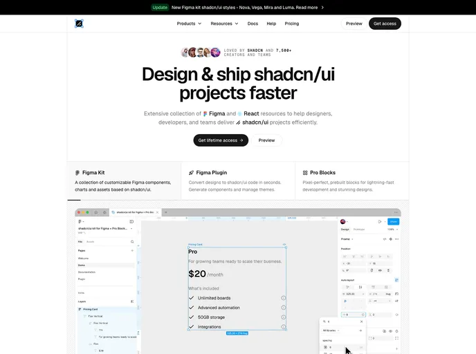

Shadcndesign
shadcn/ui kit for Figma with Pro Blocks, templates, a Figma-to-code plugin, and Agent Skills for exporting designs to production-ready React components.

Shadcnblocks Figma Kit
Premium shadcn/ui Figma kit with 500+ pro blocks, full component library, light/dark themes, Tweakcn support, and design-to-code links for every block.


Shadcnspace Figma Kit
Premium shadcn/ui Figma kit with 257+ pro blocks, full component library, light/dark themes, and direct code mapping aligned with Shadcnspace React UI.


Shadcn Studio Figma Kit
Premium shadcn/ui Figma design system with 1000+ component variants, 750+ blocks, Figma Slots, 20+ themes, and an AI Figma-to-code plugin.

Shadcn UI Kit
Shadcn UI Kit is a comprehensive collection of ready-to-use admin dashboards, website templates, and customizable components. This is a free version. Use the link to get PRO.


Myna UI
TailwindCSS and shadcn/ui UI Kit for Figma and React