


 ark-cn
ARK CN
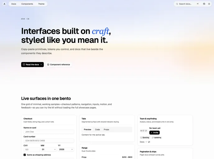
Accessible shadcn/ui components built with React, TypeScript, and Tailwind CSS. Copy-paste ready, and customizable. Built by ARK UI.
- Free
- Price
- Sep 17, 2026
- Listed
 Open ARK CN
Overview
ARK CN is a shadcn-style registry of accessible React components built on Ark UI, with styling in Tailwind CSS and full TypeScript. Components are copy-paste primitives with tokens the project controls, and the docs sit beside the components they describe.
The registry has 76 items, every one built on @ark-ui/react. Because Ark UI offers primitives that standard shadcn/ui does not, ARK CN includes pieces such as an angle slider, signature pad, image cropper, QR code, floating panel, guided tour and tree view, alongside familiar components like dialogs, menus and tabs. Keyboard routes, focus handling and ARIA come wired in.
Features
- Forms: Angle slider, color picker, combobox, date picker, editable, file upload, number field, password input, pin input, rating group, signature pad and tags input.
- Overlays: Alert dialog, command, dialog, floating panel, hover card, menu, popover, sheet, tooltip and tour.
- Navigation: Accordion, breadcrumb, pagination, sidebar, steps, tabs and tree view.
- Feedback: Alerts, circular and linear progress, spinner, timer and toast.
- Display: Carousel, image cropper, marquee, QR code, splitter and zoom image.
- Utilities: Download trigger, focus trap, byte and time formatters, highlight, locale provider and presence.
- Accessible by default: Ark UI handles keyboard interaction, focus and ARIA.
Tech stack
- React, TypeScript
- Ark UI (@ark-ui/react)
- Tailwind CSS with tw-animate-css
- class-variance-authority, lucide-react
Registry
Install via the shadcn CLI registry:
npx shadcn@latest add @ark-cn/component-name







