


 avertra-ui
Avertra UI
A collection of React components built with Tailwind CSS, designed to help you create beautiful and responsive user interfaces with ease.
- Free
- Price
- Sep 21, 2026
- Listed
 Open Avertra UI
Overview
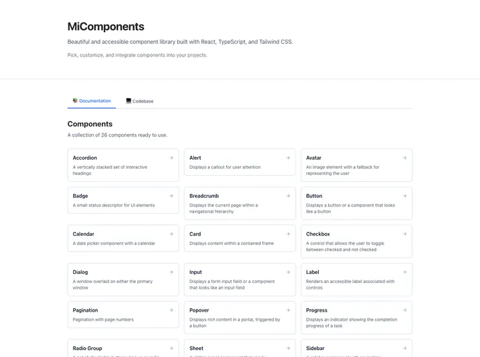
Avertra UI, published as MiComponents, is a React component library built with TypeScript and Tailwind CSS. The documentation site describes it as a set of accessible components that can be picked, customized and integrated into projects, and the homepage lists 26 core components with live previews.
The shadcn registry at micomponents.micustomer.io serves 31 items. Beyond the familiar primitives, it adds pieces such as a floating-label input, OTP input, stepper, social link, info tooltip and a WYSIWYG content viewer.
Features
- Form controls: Input, floating-label input, OTP input, textarea, checkbox, radio group, switch, toggle and slider.
- Navigation: Breadcrumb, pagination, tabs, sidebar and a links component.
- Overlays: Dialog, popover, sheet, tooltip and info tooltip.
- Feedback and status: Alert, progress bar, spinner, stepper, badge and tag.
- Data display: Table, card, avatar, calendar, heading and accordion.
- Content viewer: A
wysiwyg-viewercomponent renders rich text content.
Tech stack
- React, TypeScript
- Tailwind CSS
- shadcn CLI registry
Registry
Install via the shadcn CLI registry:
npx shadcn@latest add @avertra-ui/component-name







