


 chewypixel
Chewypixel
Animated components from the Chewypixel templates, built with Motion.
- Free
- Price
- Oct 19, 2026
- Listed
 Open Chewypixel
Overview
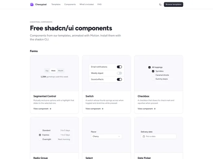
Chewypixel is a free set of animated shadcn/ui components taken from the Chewypixel templates and animated with Motion. The registry contains 25 UI components that install by name through the shadcn CLI and can be used in any project.
The components cover forms, overlays, navigation and display. Most are built on Radix UI primitives, with springy press states, frosted panels and enter and exit animations added on top, and many use Untitled UI icons.
Features
- Form controls: Segmented control, switch, checkbox, radio group, select, date picker, password input, code input and emoji picker.
- Overlays: Tooltip, dialog, sheet, dropdown menu, command palette and popover that animate in and out before closing.
- Navigation: Underline tabs with a sliding indicator and a collapsible that animates its height.
- Display components: Status dot, animated number, image lightbox, copy button, shimmer text, avatar group and typing indicator.
- Error illustrations: A status graphic component with animated art for 404, 403 and 500 pages.
- Code input details: One box per digit with a blinking caret, paste support and SMS autofill.
Tech stack
- React, shadcn/ui
- Motion
- Radix UI, cmdk
- Untitled UI icons
Registry
Install via the shadcn CLI registry:
npx shadcn@latest add @chewypixel/component-name







