


 cnippet
Cnippet UI
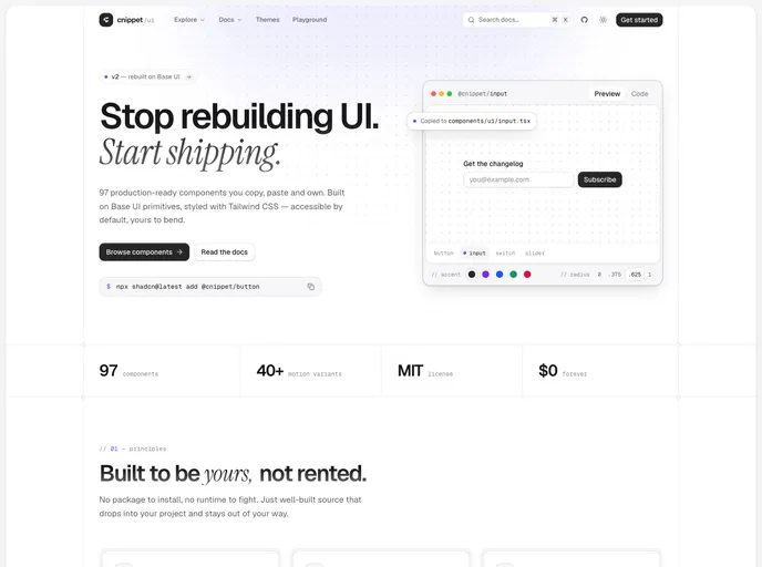
Cnippet UI is a production-ready, curated set of accessible and composable React components—built with Base UI and Tailwind CSS. Copy, paste, and ship stunning interfaces faster.
- Free
- Price
- Jul 20, 2026
- Listed
 Open Cnippet UI
Overview
Cnippet UI is an MIT-licensed library of copy-paste React components built on Base UI primitives and styled with Tailwind CSS. Its README describes it as like shadcn/ui, but powered by Base UI instead of Radix. Version 2 was rebuilt on Base UI, and the site lists 97 components and more than 40 motion variants.
Components install with the shadcn CLI into components/ui/ as readable source, with no wrapper package. The registry also carries a large set of numbered example variants for each component, plus blocks, themes and a playground. Cnippet says the components work with Next.js, React, Vite, Remix, Astro and Laravel.
Features
- 97 components: Buttons, dialogs, tables, forms, menus, sidebars, steppers, timelines, toasts and more.
- Base UI primitives: Correct ARIA and focus handling with full keyboard and screen reader support.
- Motion originals: Text shimmer, sliding number, flip words, scramble hover, typewriter and letter swap effects not found in stock shadcn/ui.
- Extra inputs: OTP field, number field, tag input, time picker, color picker, rating, file upload and sortable lists.
- Theming: Every component reads a shared set of CSS variables for accent and radius, with optional color tokens such as
@cnippet/colors-zinc. - Install all at once:
npx shadcn@latest add @cnippet/uiadds every component in one pass.
Tech stack
- React, Base UI
- Tailwind CSS v4
- Motion
- TypeScript
Registry
Install via the shadcn CLI registry:
npx shadcn@latest add @cnippet/component-name







