


 corsair-ui
Corsair UI
Copy-and-own React components for Tailwind CSS 3 and 4: forms, overlays, site chrome, motion, animated text and backgrounds.
- Free
- Price
- Sep 28, 2026
- Listed
 Open Corsair UI
Overview
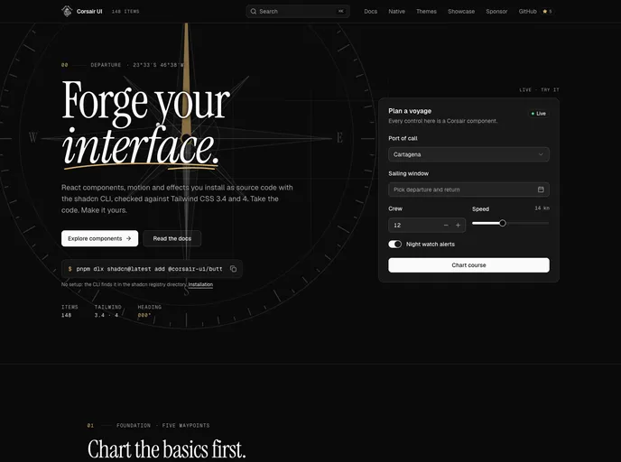
Corsair UI is an open-source, MIT-licensed library of React components, motion effects and page blocks for shadcn/ui. Its README lists 148 accessible web items checked against Tailwind CSS 3.4 and 4, plus 25 React Native counterparts for Expo SDK 54 and 57. Everything installs as source code with the shadcn CLI, and @corsair-ui is listed in the shadcn registry directory, so no extra config is needed.
Components are built on Radix. The site uses a nautical theme throughout its live demos, and each item has a docs page with examples, its API and accessibility notes. A theme item sets colors, radius and base styles once per project.
Features
- Foundation components: Buttons with six variants, a loading state and
asChild, inputs with addons, badges, cards and tooltips. - Forms:
FormFieldwires react-hook-form labels, help text and ARIA attributes, with errors driven byaria-invalid. - Date range picker: Opens a calendar in a popover and submits yyyy-mm-dd values.
- Motion and effects: Split-flap displays, scroll scenes, animated text and backgrounds that respect reduced motion.
- Theme item:
@corsair-ui/themeinstalls colors, radius and base styles. - React Native: The same component names, variants and colors for Expo through the
@corsair-nativenamespace. - Tailwind 3.4 and 4: Every web item is checked against both versions.
Tech stack
- React, Next.js
- shadcn/ui, Radix
- Tailwind CSS 3.4 and 4
- Expo and React Native Reanimated for native items
Registry
Install via the shadcn CLI registry:
npx shadcn@latest add @corsair-ui/component-name







