


 cubby-ui
Cubby UI
An opinionated component library with curated styling and simplified patterns for common use cases. Built on Base UI and Tailwind CSS 4.
- Free
- Price
- Jun 5, 2026
- Listed
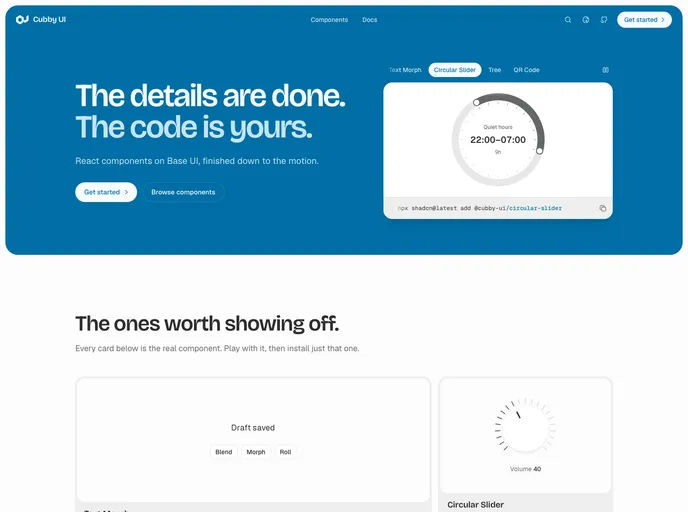 Open Cubby UI
Overview
Cubby UI is an opinionated React component library built on Base UI and Tailwind CSS 4, with curated styling and simplified patterns for common use cases. Components are copied into the project with the shadcn CLI, one per command, as plain React and Tailwind files commented where it matters.
The registry lists 70 UI components plus hooks and helpers. Beyond the standard set from accordion to tooltip, Cubby UI adds finished pieces like a text morph, a circular slider, a tree, a zero-dependency QR code generator and a sentence-style filter bar. The project is licensed under MIT plus Commons Clause.
Features
- Text morph: Animates a label from one value to the next, glyph by glyph, with blend, morph and roll modes.
- Circular slider: A radial input dragged around a ring or turned like a knob.
- QR code: A from-scratch QR generator rendered as scalable SVG.
- Transition panel: A direction-aware animated swap between named views with automatic height animation.
- Filters: A filter bar of sentence-like chips with per-field operators and a searchable add menu.
- Code block and marching border: Syntax-highlighted code with copy, and an animated dashed border that follows its parent's radius.
- Data components: Data table, tree, timeline, date range picker and virtualized lists via
use-list-virtualizer.
Tech stack
- React, Base UI
- Tailwind CSS 4
- Hugeicons, Motion, Shiki
- TanStack Table and TanStack Virtual
Registry
Install via the shadcn CLI registry:
npx shadcn@latest add @cubby-ui/component-name







