



 delta
Delta Components
Delta Components is a high-performance component library designed for developers creating AI and media-rich interfaces, particularly those utilizing Next.js and React.
- Free
- Price
- Feb 1, 2026
- Listed
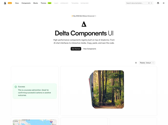 Open Delta Components
Overview
Delta Components is a free, open-source collection of UI components by software engineer Patrick Prunty, distributed through the shadcn registry. He describes it as the components he has refined over the years, the ones that make the difference, so the set is small and curated rather than exhaustive.
The site lists 11 components, including a markdown editor, code block, product card, bottom navigation and embeds. The registry adds shared libraries for tokens, surfaces, motion and icon context, and the site's customizer switches between system, light and dark themes, rounded or pill radius, default or compact sizing, and five icon sets. Several components are built on Base UI.
Features
- Editor: A CodeMirror-based markdown editor where syntax marks appear only where the caret is.
- Code: A syntax-highlighted code block using Prism.
- Product card: A product card with image, title, category and price.
- Navigation: Tabs and a mobile-style bottom nav.
- Controls: Button with primary, secondary, tertiary and ghost variants, plus switch and tooltip.
- Media: Embed, image with click-to-enlarge and an MP3 player.
- Icon choice: Lucide, Tabler, Phosphor, HugeIcons or Untitled UI icons through a shared icon context.
Tech stack
- React, Base UI
- Tailwind CSS, shadcn registry
- CodeMirror, Prism
Registry
Install via the shadcn CLI registry:
npx shadcn@latest add @delta/component-name