


 dgit
Dgit
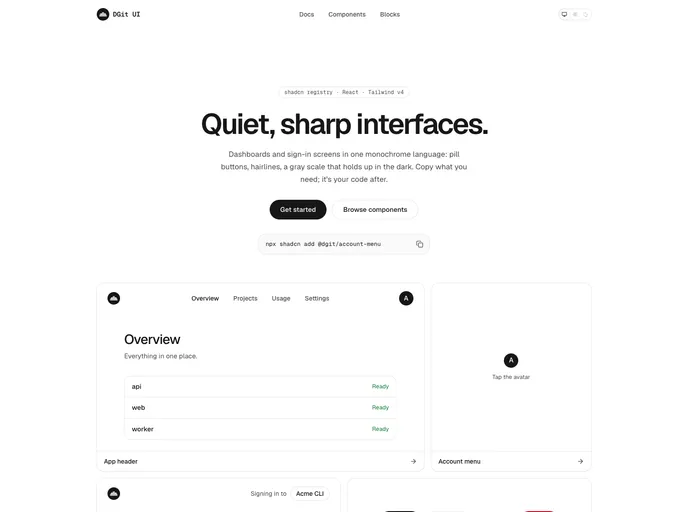
Quiet, sharp React components for dashboards and sign-in screens: a neutral light and dark theme, pill buttons, menus, an account menu, an app header, a sidebar layout, and a sign-in page.
- Free
- Price
- Sep 28, 2026
- Listed
 Open Dgit
Overview
DGit UI is an MIT-licensed shadcn registry of quiet, sharp React components for dashboards and sign-in screens. It contains 12 items built with React, Tailwind CSS v4, Radix UI and lucide icons, and shadcn add copies the source into the project to own and change.
The set is small and opinionated: a neutral gray theme for light and dark, pill buttons 40px tall by default, a floating menu with no positioning library, and blocks for an app header, a sidebar layout and a sign-in page. It also includes a framework-free docs renderer that turns Markdown with Mintlify-style components into HTML strings.
Features
- Theme: A neutral gray scale for light and dark using shadcn's color names, plus a type scale and menu animation.
- useTheme: System, light or dark mode stored in localStorage and applied as
<html data-theme>, with a first-paint script. - Menus: A floating panel with 12px corners and 36px rows, and an account menu with name, email, theme switch and log out.
- Page helpers: PageHeader, Section, rounded List rows, Notice and an
ago()relative time helper. - Copy and segmented controls: CopyButton, CopyField and a two- or three-option segmented pill.
- Sidebar layout: Drill-in groups, sliding route layers, a scope switcher with breadcrumbs and a phone drawer.
- Sign-in page: A centered 384px column with stacked pill choices, a code field and a "Signing in to" line.
- Docs renderer: Steps, accordions, callouts, tabs and code groups, with a side menu, on-page TOC, JSON search index and
llms.txt.
Tech stack
- React, Tailwind CSS v4
- Radix UI
- lucide-react
Registry
Install via the shadcn CLI registry:
npx shadcn@latest add @dgit/component-name







