



 emerald-ui
Emerald UI
Emerald UI is a collection of components designed for developers using Motion, GSAP, Tailwind CSS, and shadcn/ui.
- Free
- Price
- May 15, 2026
- Listed
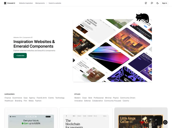 Open Emerald UI
Overview
Emerald UI is a collection of copy-ready React components for developers using Motion, GSAP, Tailwind CSS and shadcn/ui. Components are installed as JSX source and edited like project code. The library is split into two groups: Motion components and GSAP components.
Alongside the component library, the site maintains Website Collections, a gallery of website inspiration, and publishes its source code.
Features
- Motion components: 3D marquee, animated dropdown, animated input, animated number, flip card, hero parallax, gradient file upload, subscribe input, text tooltip and a cat voice recorder.
- Sections: Buttons, cards, footer and pricing components.
- GSAP text effects: Color text reveal, fancy text hover, scroll text reveal (two versions), text reveal and title mask effect.
- GSAP interactions: Image trail, magnetic effect, link hover, morphing highlighter and perspective story card.
- GSAP sections: Projects section, interactive team and sticky cards section.
- Website collections: A curated gallery of websites for design inspiration.
Tech stack
- React, Tailwind CSS, shadcn/ui
- Motion, GSAP
Registry
Install via the shadcn CLI registry:
npx shadcn@latest add @emerald-ui/component-name