


 fibo
Fibo
An achromatic design system on Base UI: the standard parts plus playful niche components, with semantic tokens that match Figma variables one to one.
- Free
- Price
- Sep 28, 2026
- Listed
 Open Fibo
Overview
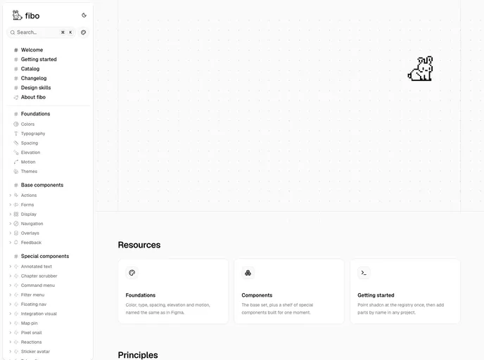
Fibo is an achromatic design system built on shadcn/ui and Base UI, documented in Storybook and installed from a shadcn registry. It pairs the standard interface parts with a set of playful, niche components, and its semantic tokens map one to one with Figma variables.
The registry contains 50 UI components, 3 blocks and 3 themes (a base theme plus mechanical and electrical variants).
Features
- Standard components: Button, input, select, checkbox, radio group, switch, slider, dialog, sheet, tabs, table, toast and tooltip.
- Data and editing: Data table on TanStack Table, filter menu, search input and a rich text editor built with Tiptap.
- Chat and messaging: Chat composer, message list, typing indicator, reactions and voice memo.
- Niche components: Annotated text, chapter scrubber, jump bar, map pin, token flow, sticker avatar, pixel snail and status dot.
- Blocks: App shell, settings page and sitemap.
- Figma parity: Semantic tokens match Figma variables one to one.
Tech stack
- React, shadcn/ui, Base UI
- Tailwind CSS, class-variance-authority, lucide-react
- Motion, TanStack Table, Tiptap
- Storybook for documentation
Registry
Install via the shadcn CLI registry:
npx shadcn@latest add @fibo/component-name







