


 fluent2-react-kit
Fluent 2 React Kit
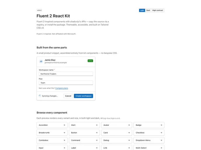
Fluent 2-inspired React components with shadcn-style APIs. Design tokens with light, dark, and high-contrast themes, Base UI primitives, Tailwind CSS v4. Independent open-source project, not affiliated with Microsoft.
- Free
- Price
- Sep 12, 2026
- Listed
 Open Fluent 2 React Kit
Overview
Fluent 2 React Kit brings the visual language of Microsoft's Fluent 2 to React with shadcn/ui's APIs and developer experience. It is an independent, community-built open-source project, not affiliated with Microsoft, and uses no Fluent UI source code; its tokens are derived from publicly documented Fluent 2 design values.
Every component is a shadcn registry item that copies source into the project, and the kit is also published as the @graundtech/fluent2-react-kit npm package. The site is at version 0.6.0 and lists 35 components plus a theme item and a cn() utility. Each component ships with Vitest and Testing Library tests and an axe-core accessibility check, 494 tests in total.
Features
- Fluent 2 styling: Brand blue, flat surfaces, Fluent radius, elevation and motion scales, and a Segoe UI-first type stack.
- shadcn-style APIs: Function components with cva variants,
data-slothooks,asChildand familiarvariantandsizeprops. - Three themes: Light, dark and high contrast, with automatic
forced-colorssupport for Windows high-contrast mode. - Fluent-specific components: Ribbon, ribbon collapse, split button, toolbar, overflow and multi-select.
- Core components: Accordion, alert, avatar, badge, button, card, combobox, command, dialog, dropdown menu, select, tabs, toast and tooltip.
- Single token layer:
tokens.cssdrives everything through a Tailwind v4@theme inlinebridge.
Tech stack
- React, Tailwind CSS v4, Base UI
- class-variance-authority,
@fluentui/react-icons - Vitest, Testing Library, axe-core
Registry
Install via the shadcn CLI registry:
npx shadcn@latest add @fluent2-react-kit/component-name







