


 glassyui
Glassy UI
Glassy UI for React and Next.js: 37 glass components, a CSS glass theme, and drop-in component sets.
- Free
- Price
- Oct 22, 2026
- Listed
 Open Glassy UI
Overview
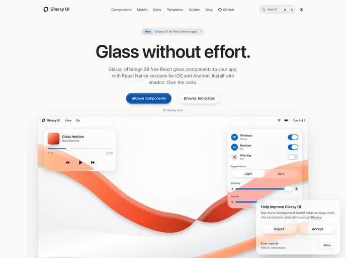
Glassy UI is a free, MIT-licensed library of glass-style React components for React 19 apps such as Next.js and Vite, with Tailwind CSS 4. The site lists 38 components, and each one installs with the shadcn CLI so the source is owned by the project. The glass is drawn with CSS, SVG and WebGL.
The registry also includes a Glassy theme and drop-in component sets for the shadcn New York and Base Nova styles. A companion React Native library brings 29 of the components to Expo apps, and the site offers templates, guides and an llms.txt.
Features
- Controls: Button, input, textarea, checkbox, radio group, select, switch, slider and segmented control.
- Overlays: Dialog, popover, sheet, menu and command list that filters as you type.
- Navigation: Header, tabs, accordion, dock, breadcrumb and pagination.
- Feedback: Tooltip, toast, badge, progress, spinner, skeleton and a tinted alert with four tones.
- Surfaces: Glass surface, panel, avatar with presence dot and stacked groups, kbd and scroll area.
- Effects: A WebGL2 scene that refracts a backdrop through the glass, a draggable lens magnifier and a logo reveal.
- Mockups: Laptop and phone duo frames.
- Drop-in sets: Glass versions packaged for the New York and Base Nova shadcn styles.
Tech stack
- React 19, Tailwind CSS 4, shadcn CLI
- Radix UI primitives, CSS, SVG and WebGL
Registry
Install via the shadcn CLI registry:
npx shadcn@latest add @glassyui/component-name







