


 glint-ui
Glint UI
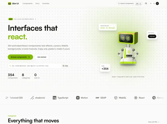
354 animated React components you copy, paste and own: text effects, cursors, WebGL backgrounds, micro-interactions, UI primitives and mascots. Built with Tailwind CSS v4 and shadcn tokens.
- Free
- Price
- Oct 2, 2026
- Listed
 Open Glint UI
Overview
Glint UI is a library of 354 animated React components to copy, paste and own, built with Tailwind CSS v4 and shadcn tokens. Every item is published in its shadcn registry, and the site supports search and saving favorites.
The catalog leans toward expressive visuals: backgrounds and canvas effects make up a large share, alongside text animations, cursors, micro-interactions, standard UI primitives and a set of widgets and mascots. Most components animate with Motion, and a few use physics or 3D libraries.
Features
- Backgrounds: Aurora dots, background paths, Bayer waves, contour map, CRT warp, dot terrain, cosmic background and film grain.
- Text animations: ASCII text, cipher reveal, departure board, electric text, crease type, extrude type and bracket focus.
- Cursors and animations: After cursor, follow cursor, cursor highlight, flock trail, beam pour, block dissolve and chrome pour.
- Micro-interactions: Ask box, crumple delete, fling confirm, fling toast and fizz menu.
- Components: Animated tabs, animated testimonials, bento grid, card flip, expandable cards, expandable dock, dynamic island and drum picker.
- UI primitives: Accordion, alert dialog, avatar, badge, button, calendar, card, checkbox, code block, dialog, drawer and dropdown menu.
- Widgets and mascots: Clock, arc sidebar, bead tray and the Glint bot.
Tech stack
- React, Tailwind CSS v4, shadcn tokens
- Motion, lucide-react, react-use-measure, figma-squircle
- matter-js and three.js for specific components
Registry
Install via the shadcn CLI registry:
npx shadcn@latest add @glint-ui/component-name







