



 gooseui
Goose UI
Goose UI is an open-source component library designed to enhance the development experience for React and Next.js developers.
- Free
- Price
- May 5, 2026
- Listed
 Open Goose UI
Overview
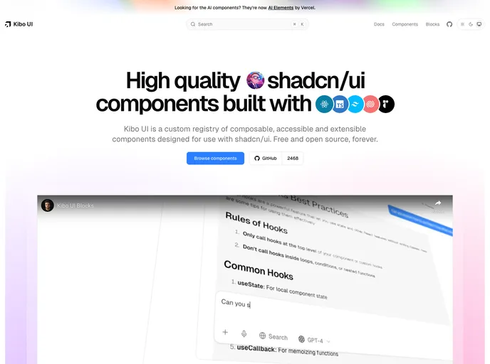
GooseUI is a free, open-source component library for React and Next.js built on top of shadcn/ui. It ships as a custom shadcn registry, so each component is copied into the project's components/ui folder and stays fully editable, and it can sit alongside stock shadcn/ui components in the same app.
The registry currently lists 19 items: core form and layout primitives such as button, card, input, label and textarea, plus animated pieces like a sliding-digit clock, a morphing dialog, a border beam effect and a custom toast system. Styling uses Tailwind CSS and CSS variables, with Radix UI underneath for accessibility.
Features
- Theme customizer: A floating theme and color picker that comes in 5 variants.
- Toast system: A themed Sonner provider, a custom toast with progress bar and colored variants, and helper functions for showing notifications.
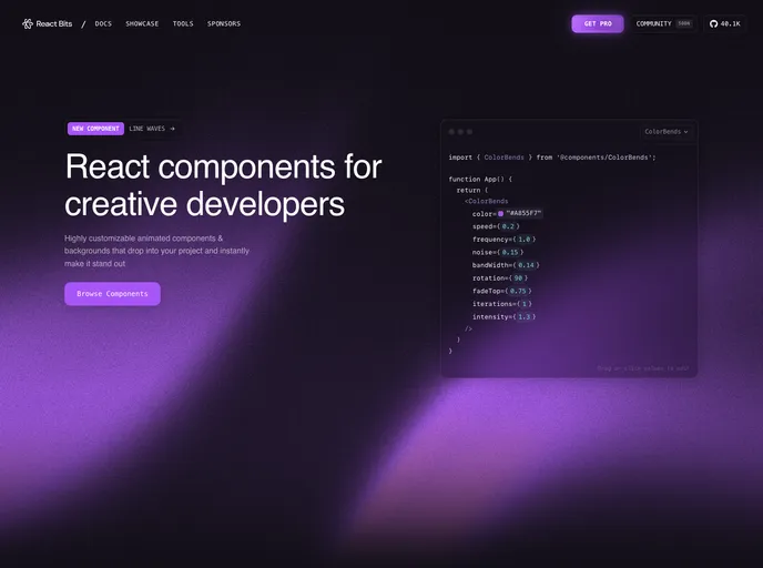
- Effects: Border Beam, an animated beam of light that travels along a container's border, plus text effects.
- Animated components: An animated timer with sliding digits and gradient border, a morphing dialog and an animated checkbox.
- Utility components: Baseline Status badges, a scroll-to-top button with pill, progress and text variants, and a promo banner with marquee animation.
- Ready-made blocks: Landing page sections, forms and cards, including a features grid.
- Dark and light mode: Full theme support through next-themes.
Tech stack
- Next.js 15 (App Router)
- Tailwind CSS v4
- Radix UI primitives
- Motion
- Lucide React
- next-themes
Registry
Install via the shadcn CLI registry:
npx shadcn@latest add @gooseui/component-name