


 herocn
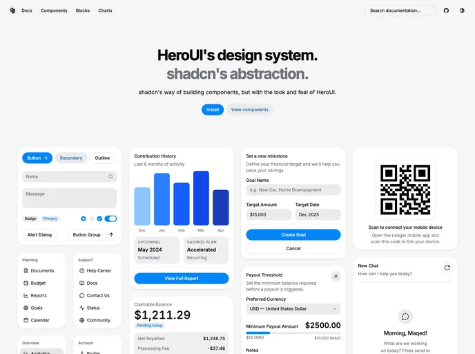
HeroUI's design system, shadcn's abstraction.
- Free
- Price
- Sep 21, 2026
- Listed
 Open herocn
Overview
herocn brings HeroUI's design system to shadcn/ui's way of building components. Components keep shadcn's abstraction (copied into the project and installed with the CLI) but take on the look and feel of HeroUI. It is open source on GitHub.
The registry is large: 66 UI components, 97 blocks, 2 hooks and over 500 examples. Alongside the standard shadcn set (accordion, dialog, sidebar, table, input OTP and the rest), it adds chat-oriented pieces such as message, bubble, message scroller and attachment. The homepage demos finance dashboards, settings forms and an AI chat with streaming scroll behavior.
Features
- HeroUI styling: shadcn component APIs with HeroUI's visual design.
- Full component set: Alert, button group, calendar, chart, combobox, command, drawer, field, input group, item, kbd, navigation menu, sidebar, toast and more.
- Chat components: Message, bubble, message scroller, attachment and code block for AI and messaging UIs.
- Extra primitives: Surface, marker, trace and questionnaire components.
- Blocks: Login and signup pages, 16 sidebar layouts, a dashboard and dozens of area, bar, line and pie chart blocks.
- Examples: More than 500 example items covering component variants.
- Hooks:
use-mobileanduse-highlighted-code.
Registry
Install via the shadcn CLI registry:
npx shadcn@latest add @herocn/component-name







