


 ilinxa
 pro-ui
High-level composed components for shadcn/ui — kanban, gantt, calendar, media editors, story viewers, flow canvas, forms, and more, each with optional demo fixtures.
- Free
- Price
- Aug 20, 2026
- Listed
 Open ilinxa pro-ui
Overview
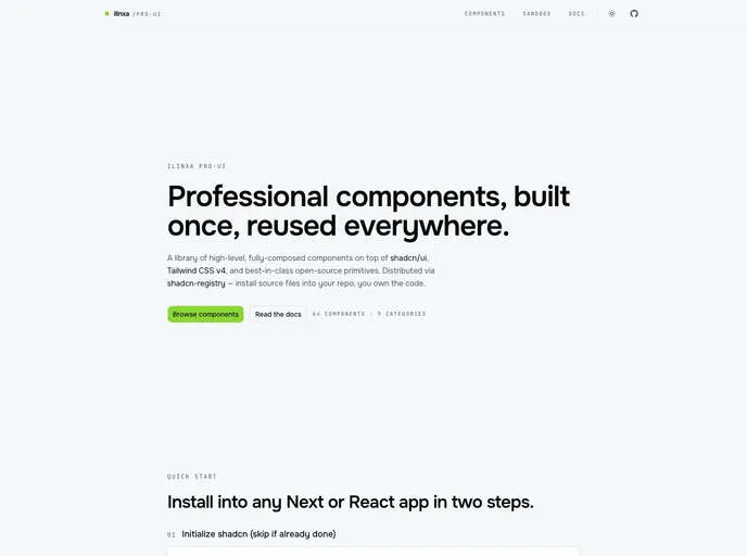
ilinxa pro-ui is a library of high-level, fully composed React components built on shadcn/ui, Tailwind CSS v4 and React 19. Rather than primitives, it ships finished building blocks such as kanban boards, gantt timelines, event calendars, media editors and story viewers, installed as source through the @ilinxa namespace. The project is at v0.1.0 alpha and lists 64 components in 9 categories.
Most components have a matching -fixtures item that installs example data, which makes it quick to see a component working before wiring real data. Components import only React, shadcn primitives and declared dependencies, never next/*, so they run in Next.js, Vite, Remix or Astro islands, provided the shadcn token set is in place.
Features
- Project and task tools: Kanban board, gantt timeline, task tree, task card, todo tree and progress timeline.
- Calendars and events: Event calendar with editing, schedule list, event card and registration card.
- Media: Media editor with capture, media library, media carousel, video player, PDF viewer and story composer and viewer.
- Content and editorial: Rich text editor, markdown editor, magazine layout, article meta, post card, comment thread and share bar.
- Workspace UI: Flow canvas, blackboard, split workspace, file manager, file tree, data table, filter panel and app sidebar.
- Forms: Properties form, JSON form, signup form and entity picker.
- Team gamification: Team progress bar, trophy shelf, quest log, challenge and task claim components.
- Demo fixtures: Optional
-fixturesinstalls with example data.
Tech stack
- React 19
- Tailwind CSS v4
- shadcn/ui
Registry
Install via the shadcn CLI registry:
npx shadcn@latest add @ilinxa/component-name







