


 interior
Interior
Copy-paste React micro-interactions: a headless hook plus a styled example in one self-contained file, with motion as the only dependency.
- Free
- Price
- Aug 4, 2026
- Listed
 Open Interior
Overview
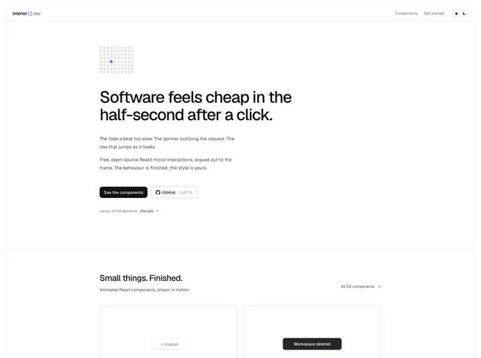
Interior is a free, open-source library of React micro-interactions focused on "the half-second after a click": the fade that is a beat too slow, the spinner that outlives the request, the row that jumps as it loads. Each item is a single self-contained file containing a headless hook plus a styled example, with Motion as the only dependency. The behavior is finished, and the styling is left to the project.
The registry lists 54 components, installable with the shadcn CLI into components/interior. It is written in TypeScript with Tailwind CSS, MIT licensed, and was named Library of the Month on 21st.dev.
Features
- Buttons and actions: Copy button, loading button, hold to confirm, like burst, ripple, press depth and long press.
- Form feedback: Floating label, inline validation, password strength, OTP input and tag input.
- Loading and streaming: Skeleton swap, progress bar, load more, streaming text, typing indicator and new items pill.
- Overlays and menus: Modal, popover, tooltip group, command palette, drawer, context menu and dropdown.
- Navigation and scroll: Tabs, segmented control, wizard steps, sticky header, reading progress, scroll spy and hide on scroll.
- Data and lists: Sortable table, filter grid, value flash, poll results, reorder list, swipe deck and tree view.
- Headless hooks: Each component pairs its styled example with a reusable hook.
Tech stack
- React, TypeScript
- Tailwind CSS
- Motion
Registry
Install via the shadcn CLI registry:
npx shadcn@latest add @interior/component-name







