


 keyframeui
Keyframeui
Animated React components built with Tailwind CSS, Motion and GSAP, installable with the shadcn CLI.
- Free
- Price
- Oct 12, 2026
- Listed
 Open Keyframeui
Overview
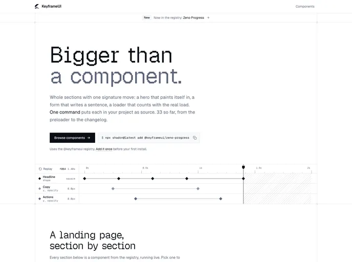
KeyframeUI is a registry of animated React components for shadcn/ui, built with Tailwind CSS and Motion. Instead of small primitives, most items are whole landing page sections with one signature interaction, such as a hero that paints itself in, a form that writes a sentence or a loader that counts with the real load.
The registry currently holds 33 components, from a preloader to a changelog release pill, plus 105 demo blocks that show each one in context (pricing, case studies, team pages, dashboards). Every item installs as source with a single shadcn CLI command, and the only runtime dependencies listed are motion, clsx and tailwind-merge.
Features
- 33 animated components: Includes Tilt Card, Arc Scroll, Morph Search, Spotlight Tour, Odometer, Paint Reveal, Sentence Form, Pricing Dock and Xray Lens.
- Demo blocks: 105 ready-made demos, such as an odometer pricing table, an arc-scroll company timeline and a sticky-deck case study.
- Section-by-section landing page: The homepage assembles a full page from registry items, from navigation to contact form.
- Source you keep: Each component or demo is copied into the project with the shadcn CLI.
- Light dependency footprint: Components rely on Motion plus
clsxandtailwind-merge. - Product motion planned: The site lists undo and redo, sorting and filtering, saving and loading states as the next areas.
Tech stack
- React, Tailwind CSS, Motion
- shadcn CLI registry
Registry
Install via the shadcn CLI registry:
npx shadcn@latest add @keyframeui/component-name







