


 kobra
Kobra
Polished components for teams building exceptional products and experiences.
- Free
- Price
- Sep 12, 2026
- Listed
 Open Kobra
Overview
Kobra is a component library for product teams, built on Tailwind CSS and Base UI, with every component designed in light and dark and with all states covered. The gallery is free to browse, and its registry exposes 84 UI components plus calendar system utilities (Hijri, Persian, Buddhist, Minguo and Japanese).
Kobra offers a free tier of 10 components for personal use and a paid Pro license with all 100+ components, unlimited commercial projects, lifetime updates and an MCP server. The site states components are screen reader tested to WCAG 2.1 AA. A free Figma kit uses the same tokens as the code, and an optional synthesized sound layer adds short interface sounds.
Features
- Agent UI: Reasoning steps, chat history, trace waterfall, file diff, streaming text, inline citations, plan cards, question cards and a chat input.
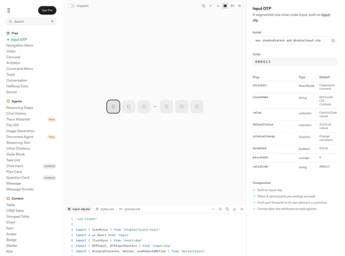
- Form controls: Input OTP, input dissolve, combobox, multi-select, color picker, icon picker, filter chips and a magnetic dropzone.
- Data display: Tables including CRM and grouped tables, charts, QR codes, lightbox and attachments.
- Overlays and navigation: Dialog, sheet, drawer, popover, command menu, sidebar, tabs and menubar.
- Interface sound: A synthesized sound layer installed once around the app.
- Figma kit and agent file: A free Community Figma kit and one prompt file for coding agents.
- Pro extras: AI skills for motion, sound and migration, and an MCP server.
Tech stack
- React, Tailwind CSS, Base UI
Registry
Install via the shadcn CLI registry:
npx shadcn@latest add @kobra/component-name







