


 lema-ds
Lema Ds
Enterprise-grade design system and component library for LEMA-UFPB
- Free
- Price
- Sep 17, 2026
- Listed
 Open Lema Ds
Overview
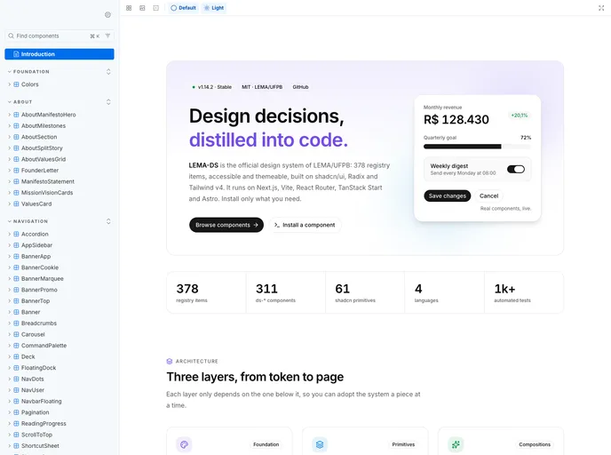
LEMA-DS is the official design system of LEMA (Laboratório de Economia e Modelagem Aplicada) at the Universidade Federal da Paraíba in Brazil. It is a React component library built on shadcn/ui and Radix UI, documented in a Storybook with components, tokens and usage docs (in Portuguese).
According to its llms.txt, the registry holds 377 items: 311 ds-* components, 61 shadcn primitives and 5 shared libraries. Alongside the shadcn CLI, items can be installed with the project's own @lema-ufpb/ds-sync tool, and a machine-readable component catalog lists props, dependencies and example code for every story.
Features
- Marketing blocks: Heroes (terminal, video, waitlist, bento, stats), headers, footers, pricing grids and comparisons, logo clouds, FAQs, CTAs and testimonials.
- App blocks: Dashboard, app sidebar, settings, profile, onboarding, wizard, users table, schedule and event calendar.
- Auth and commerce: Auth cards, split-screen register pages, billing and checkout blocks.
- Data display: Stat cards (gauge, sparkline, heatbar, comparison), data tables, boxplot, bullet and candlestick charts, and a contribution graph.
- Advanced inputs: Cascader, cron builder, color picker, date range picker, autocomplete and command palette.
- Effects: Aurora background, border beam, cursor spotlight, confetti and animated numbers.
- Tokens and i18n: Shared
tokens,format-utilsandui-i18nlibraries plus a registry theme.
Tech stack
- React, shadcn/ui, Radix UI, Base UI, Tailwind CSS
- TanStack Table and Virtual, React Hook Form, Zod, Recharts, dnd-kit, Storybook
Registry
Install via the shadcn CLI registry:
npx shadcn@latest add @lema-ds/component-name







