


 movin
Movin
288 animated UI components: buttons, toggles, checkboxes, inputs, loaders, radios and cards. Zero dependencies for most, Framer Motion for a few, with a plain HTML/CSS version of each. MIT-0.
- Free
- Price
- Oct 22, 2026
- Listed
 Open Movin
Overview
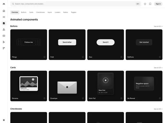
Movin is a free set of 288 animated UI components from movin.design: buttons, cards, checkboxes, inputs, loaders, radio buttons and toggles, each with its motion built in. Every component can be previewed live, then copied as code or as a prompt that describes it precisely enough for an AI coding assistant to rebuild it in another stack.
Each component ships in two formats: React with Tailwind, and plain HTML, CSS and JavaScript with no dependencies, which works in Vue, Svelte, Angular or no framework at all. In React, 281 of the 288 need nothing beyond React; the remaining few use Framer Motion and say so on their cards. Everything is published under MIT-0, with no attribution required, and the full set is also on GitHub.
Features
- Buttons (53): Filings, fold, goo, halftone, split flap, swipe confirm, hold confirm, shatter and more.
- Cards (25): Diorama, envelope, holo foil, ink reveal, lenticular, peel, receipt and scratch cards.
- Checkboxes (45): Bookmark, dog-ear, fingerprint press-and-hold, keycap and sprout styles.
- Inputs (45): Smooth caret, tag chips, code slots for verification codes and a composer.
- Loaders, radios and toggles: 39 loaders, 48 radio groups and 33 toggles, from Newton's cradle to aperture and blinds switches.
- Two formats: React + Tailwind or dependency-free HTML, CSS and JavaScript, chosen in the Code tab.
- AI prompts: Each component has a copyable prompt for rebuilding it in your own stack.
- MIT-0 license: Free for personal, client and commercial work.
Tech stack
- React, Tailwind CSS, plain HTML/CSS/JS, Framer Motion (7 components)
Registry
Install via the shadcn CLI registry:
npx shadcn@latest add @movin/component-name







