


 ns-ui
ns-ui
389 animated React components for Tailwind v4 and React 19, with a CLI and an MCP server.
- Free
- Price
- Sep 12, 2026
- Listed
 Open ns-ui
Overview
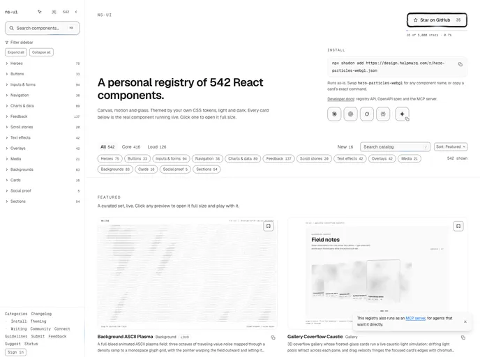
ns-ui is a personal registry of React components, now 542 strong, focused on canvas, motion and glass effects. Each component is built around a single interaction, and a screenshot test suite fails any component whose hover state looks identical to its resting state. Components are themed by the project's own CSS tokens in light and dark mode.
Every component installs by URL with the shadcn CLI. The catalog splits into 416 "core" and 126 "loud" components across heroes, buttons, inputs and forms, navigation, charts and data, feedback, scroll stories, text effects, overlays, media, backgrounds, cards and sections. Developer docs cover a registry API, an OpenAPI spec and an MCP server.
Features
- ASCII scenes: ASCII plasma, torus donut, tunnel, terrain, eclipse, globe and rainfall heroes and backgrounds.
- WebGL and shaders: A particle hero, gradient shader background and a caustic coverflow gallery.
- Forms with character: OTP reel, tag input tear, switch solder bead, sundial time picker and an inline validation error summary.
- Charts and data: Dithered and halftone bar, line, donut and radar charts, ridgelines and ASCII scatter plots.
- AI interface pieces: Citation cards, a Pareto frontier model picker, context compaction views and typing indicators.
- Feedback: 137 components such as progress wicks, notification bell swing and copy field crimp.
- Developer access: Registry API, OpenAPI spec and an MCP server.
Tech stack
- React 19, Tailwind CSS v4, Canvas, WebGL, motion, three.js
Registry
Install via the shadcn CLI registry:
npx shadcn@latest add @ns-ui/component-name







