


 opaline
Opaline
Liquid glass components for React — real backdrop refraction, Apple-inspired, minimal and premium. Docks, sheets, command palette, knobs and more.
- Free
- Price
- Sep 28, 2026
- Listed
 Open Opaline
Overview
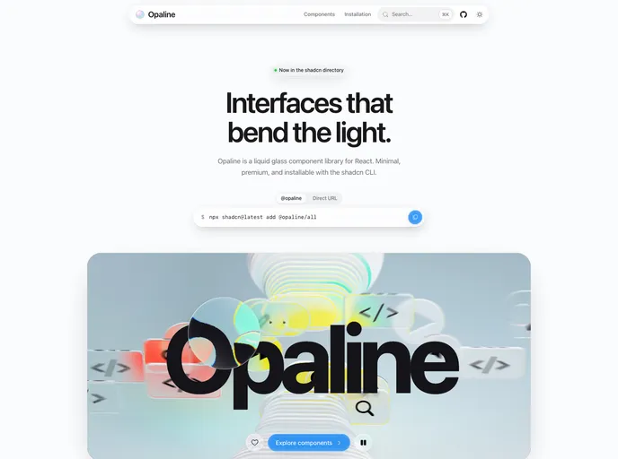
Opaline is a liquid glass component library for React, built by Buildlab and distributed through the shadcn CLI. Its 49 components take their cues from Apple's glass interfaces: docks, control centers, widgets, sheets, tab bars and a command palette, all rendered as translucent surfaces.
What separates it from blur-based glass effects is real refraction. Each surface bends the backdrop through a displacement map, rims catch the light, and controls turn into lenses when touched. The whole set can be installed at once with @opaline/all, or one component at a time.
Features
- Backdrop refraction: Surfaces distort what sits behind them through a displacement map rather than relying on a plain blur.
- macOS-style surfaces: Glass Dock, Glass Control Center, Glass Sidebar, Glass Toolbar and Glass Menu recreate desktop chrome.
- Widgets: Weather, calendar and battery widgets plus a generic Glass Widget in small and medium sizes.
- Interactive controls: Knob, stepper, slider, switch, segmented control, OTP input and date picker.
- Overlays: Sheet, drawer, dialog, popover, context menu, toast and notification components.
- Content blocks: Code block, terminal, snippet, tweet card, credit card, QR code, bento grid and scroll stack.
- One-command install:
npx shadcn@latest add @opaline/allpulls in every component plus the theme.
Tech stack
- React, Tailwind CSS, shadcn CLI registry
- Radix UI primitives, Hugeicons, cmdk, Shiki
Registry
Install via the shadcn CLI registry:
npx shadcn@latest add @opaline/component-name







