


 paceui-gsap
Paceui Gsap
Animated GSAP components crafted for smooth interaction and rich detail.
- Free
- Price
- Jul 30, 2026
- Listed
 Open Paceui Gsap
Overview
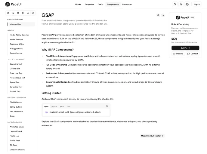
PaceUI GSAP is the free GSAP edition of PaceUI: animated React components driven by GSAP timelines for Next.js and TanStack Start, distributed as copy-paste source through the shadcn CLI. The registry holds 28 components grouped into AI, text and typography, buttons, layout, effects and utilities.
It sits alongside the main PaceUI library, which uses Motion, and gives projects that already rely on GSAP a matching set of interactions built on gsap and @gsap/react.
Features
- Text effects: Bouncing, distort, draw line, mouse wave, reveal, scramble and squash text.
- Buttons: Fillable, spring and text fall buttons plus a swap transition.
- Layout pieces: Animated stack, layered stack, flip reveal, profile peek and tilt card.
- Effects: Liquid cursor, liquid glass, overlay effect, gradient shadow, and reveal or stagger on scroll.
- AI components: Model selector, model ability selector, response writer, AI suggestions and token counter.
- Utilities: GitHub star counter, rolling number and dot loaders.
Tech stack
- React, Next.js, TanStack Start
- GSAP with
@gsap/react, Tailwind CSS, shadcn CLI registry
Registry
Install via the shadcn CLI registry:
npx shadcn@latest add @paceui-gsap/component-name







