


 pane
Pane
Liquid glass components for React.
- Free
- Price
- Sep 12, 2026
- Listed
 Open Pane
Overview
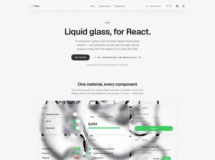
Pane is a shadcn-compatible component registry that recreates Apple's liquid glass material for React. It ships 26 components, is MIT licensed and targets React 19 with Tailwind CSS v4. Components are not delivered as an npm package; the shadcn CLI copies each one into the project so the source can be read and changed.
Everything is built on a single <Pane> primitive, so buttons, inputs, dialogs and menus refract, tint and respond as one surface. The project is made by Uniform Interface and is at version 0.4.0.
Features
- Real refraction: An SVG displacement filter bends the backdrop at the edges with a touch of chromatic aberration, rather than a plain frosted blur.
- Pointer-reactive light: A specular highlight follows the pointer and the rim catches light as the surface moves.
- Spring physics: Presses, hovers and sliding indicators move on springs tuned from one config file.
- Shared primitive: A single
<Pane>component plus glass core utilities and pointer and support hooks. - Form controls: Button, input, textarea, checkbox, radio group, switch, slider, select and toggle group.
- Overlays and navigation: Dialog, sheet, popover, dropdown menu, tooltip, command, navigation menu and sidebar.
- Display components: Card, badge, avatar, alert, progress, tabs, accordion and Sonner toasts.
Tech stack
- React 19, Tailwind CSS v4, shadcn CLI registry
- Radix UI, Motion, lucide-react, cmdk, Sonner
Registry
Install via the shadcn CLI registry:
npx shadcn@latest add @pane/component-name







