


 panelui
Panelui
Tailwind CSS components for React: KPI tiles, a lane board, flow diagrams, an interactive globe and more, from the PanelUI design system.
- Free
- Price
- Oct 16, 2026
- Listed
 Open Panelui
Overview
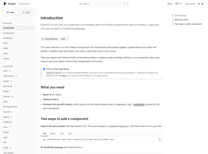
PanelUI for the web is a collection of 32 animated, data-rich React components for dashboards and product pages: a globe that turns under the pointer, numbers that roll to their new value, and cards that react to the cursor. It is the browser counterpart to panelui-native, a separate library for Expo and React Native.
Components are styled with Tailwind CSS on the theme tokens a shadcn project already defines, so they pick up existing colors and radius without extra configuration. Each one can be copied in with the shadcn CLI, landing in components/panelui/, or imported from the panelui-web npm package; both come from the same source.
Features
- Data display: KPI, Stat, Range Meter, Bar Picker and Rolling Number components for dashboard figures.
- Boards and diagrams: A Lane Board, Flow diagrams, a Day Grid and a Canvas.
- Interactive visuals: An interactive Planet globe, Soundwave and Tilt Card.
- AI and messaging: Prompt, Message and Feedback components.
- Core controls: Button, Input, Select, Switch, Tabs, Textarea, Dialog, Alert Dialog, Sheet and Menu.
- Two install paths: Copy source with the shadcn CLI or install
panelui-weband get fixes by upgrading. - Framework guides: Setup docs for Next.js, Vite, TanStack Start, React Router, Astro and Laravel, plus MCP and Skills pages.
Tech stack
- React 18 or newer, Tailwind CSS 4, shadcn/ui theme tokens
Registry
Install via the shadcn CLI registry:
npx shadcn@latest add @panelui/component-name







