


 preskok
Preskok
Accessible, production-ready React components built with React Aria Components and Tailwind CSS.
- Free
- Price
- Aug 11, 2026
- Listed
 Open Preskok
Overview
Preskok UI (preskok/ui) is a library of accessible, production-ready React components built on React Aria Components and Tailwind CSS, distributed as a shadcn registry. Its registry holds more than 100 UI components plus hooks, utilities, three themes and over 140 example demos.
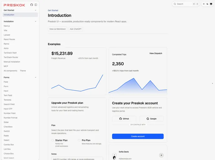
Because it is built on React Aria, components inherit keyboard, focus and screen reader behavior along with internationalized date handling. The docs include setup guides for Next.js, Vite, Laravel, React Router, Remix, Astro, TanStack Start and TanStack Router, a manual installation path, and an MCP page for AI tools. Example screens show logistics dashboards, plan upgrades and team management built from the components.
Features
- Forms: Text, search, number and OTP fields, select, combo box, multi select, token field, tag field and number formatting.
- Dates and time: Calendar, range calendar, date field, date picker, date range picker and time field.
- Color tools: Color picker, area, field, slider, swatch, swatch picker and wheel.
- Charts: Area, bar, line, pie, radial and radar charts, a bar list and tracker, plus Recharts-based versions.
- Navigation and layout: Navbar, sidebar, breadcrumbs, tabs, pagination, toolbar, tree, grid list and resizable panels.
- Overlays: Dialog, modal, drawer, sheet, popover, tooltip, context menu, dropdown and command menu.
- Rich text and media: A Tiptap-based editor, async image, avatar, carousel, drop zone and file trigger.
- Themes: Daylight, Midnight and Emerald themes.
Tech stack
- React, React Aria Components, Tailwind CSS, tailwind-variants
@internationalized/date, Recharts, Tiptap, Motion, lucide-react
Registry
Install via the shadcn CLI registry:
npx shadcn@latest add @preskok/component-name







