


 saaskit
Saaskit
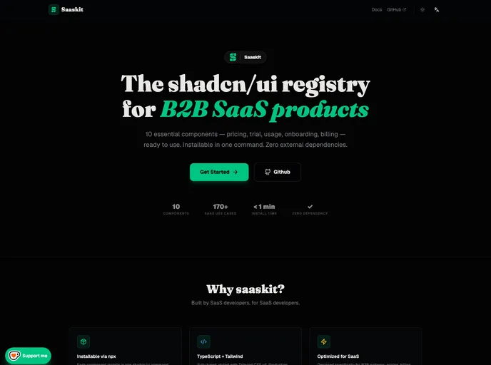
10 essential shadcn/ui components for B2B SaaS: Pricing, Billing, Usage, and Onboarding. Minimalist Soft Brutalist design.
- Free
- Price
- Jun 9, 2026
- Listed
 Open Saaskit
Overview
Saaskit is an MIT-licensed shadcn/ui registry of 10 components for B2B SaaS products, covering the monetization and activation parts of an app: pricing, billing, usage limits, onboarding, team invites and feature gating. It is made by Vidhal Elame and documented in both English and French.
Components install into a Next.js and shadcn/ui project through the @saaskit namespace. They are self-contained, with no provider and no extra npm dependencies, and the source lands in the project for editing. The visual style is described as soft brutalism, with a configurable display font (Fraunces by default) set through a --saaskit-font-display CSS variable.
Features
- PricingTable: Monthly/annual toggle, highlighted recommended plan and a feature comparison table
- UsageMeter: Progress bar for API calls, storage or credits with automatic warning and danger thresholds
- TrialBanner: Countdown banner that turns yellow at 7 days and red at 3 days, and can be dismissed
- UpgradeModal and FeatureGate: Upsell dialog and a permissions wrapper for gating plan features
- Billing and team: InvoiceRow for billing history and TeamInvite for collaboration
- Identity and developer: PlanBadge for Free, Trial, Pro and Enterprise tiers, and ApiKeyCard for key management
- OnboardingSteps: Checklist component for activation flows
- Per-component docs: Preview, usage, props and notes pages for each component
Tech stack
- React, TypeScript, Tailwind CSS v4, Radix UI, shadcn/ui
Registry
Install via the shadcn CLI registry:
npx shadcn@latest add @saaskit/component-name







