


 scrollxui
ScrollX UI
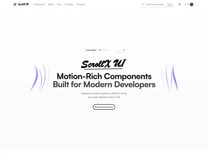
ScrollX UI is an open-source component library designed for developers utilizing React and shadcn/ui, providing animated and interactive elements for modern web interfaces.
- Free
- Price
- Apr 20, 2026
- Listed
 Open ScrollX UI
Overview
ScrollX UI is an MIT-licensed collection of animated, interactive React components and blocks, maintained by Aditya Kishore. The library has 140+ components, 30+ blocks and a small set of templates, spanning text animations, motion-driven interactions, dynamic backgrounds and standard UI elements.
Every component ships in a single format, TypeScript with Tailwind CSS, and is customized through props. Components can be copied and pasted or installed through the shadcn CLI, and the project also supports GitHub registries and MCP integration. Each demo page in the docs includes the CLI command for that component.
Features
- Text animations: Fancy text, electric text, morphing text flips, reveal text, stagger chars, typing animation and text spotlight
- Backgrounds: Aurora dots, background paths, meteors, cosmic, pixel, particles, dot wave and spark waves
- Interactive components: Hold-to-confirm button, magic dock, expandable cards, card tilt, cursor image trail, draggable avatar and infinite canvas
- UI primitives: Accordion, alert dialog, calendar, carousel, dropdown menu, input OTP, popover, select, slider, table, toast and tooltip
- Blocks: Hero, features, pricing, testimonials, FAQ, logo cloud, CTA, contact, download, waitlist and footer sections
- Install options: Copy and paste, shadcn CLI, GitHub registry or MCP
- Theming: Dark mode and responsive layouts by default, with Tailwind-first styling
Tech stack
- React, TypeScript, Tailwind CSS, shadcn CLI
Registry
Install via the shadcn CLI registry:
npx shadcn@latest add @scrollxui/component-name







