


 Shadcn Labs
Transition Kit
Free, open-source theme, page and UI transitions for React built on view transitions: 19 theme-switch styles, 18 page transitions and 17 animated UI components.
- 94
- GitHub stars
- Free
- Price
- Oct 13, 2026
- Updated
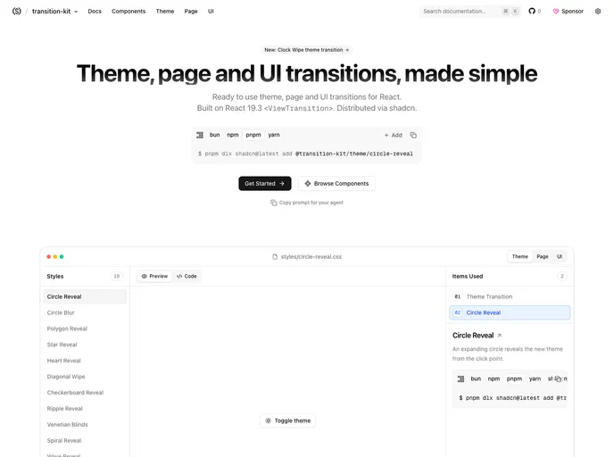 Open Transition Kit
Overview
Transition Kit is a free, MIT-licensed library of theme, page and UI transitions for React from Shadcn Labs. It is built on React's view transition APIs (<ViewTransition>, startTransition and addTransitionType), so there is no manual document.startViewTransition, and browsers without view transitions simply switch instantly.
Theme transitions animate light and dark switches from the click point, a control or the viewport center, with 4 toggle controls and 19 styles from circle and star reveals to venetian blinds and GIF reveals. Page transitions animate route changes with 18 styles, reversing for back navigation. A UI layer adds 17 components whose state changes glide, morph and slide, including tabs, carousels, a dynamic island, number flip, add-to-cart and a kanban board. Every style is a small CSS file tuned with CSS variables.
Features
- Theme transitions: 19 reveal styles and 4 toggle controls
- Page transitions: 18 styles with reversed back navigation
- UI transitions: 17 components such as tabs, carousels, dynamic island and kanban
- View transitions: Driven by React's view transition APIs
- Pure CSS: Each style is a small CSS file tuned with variables
- Graceful fallback: Instant switch where view transitions are unsupported
- shadcn registry: Install the core and styles with the shadcn CLI
Tech stack
- React 19.3+, TypeScript
- View Transitions API, CSS
Registry
Install via the shadcn CLI registry:
npx shadcn@latest add @transition-kit/theme/circle-reveal







