


 shadcnloaders
Shadcn Loaders
A public registry of shadcn-inspired animated loaders and loading states.
- Free
- Price
- Jul 20, 2026
- Listed
 Open Shadcn Loaders
Overview
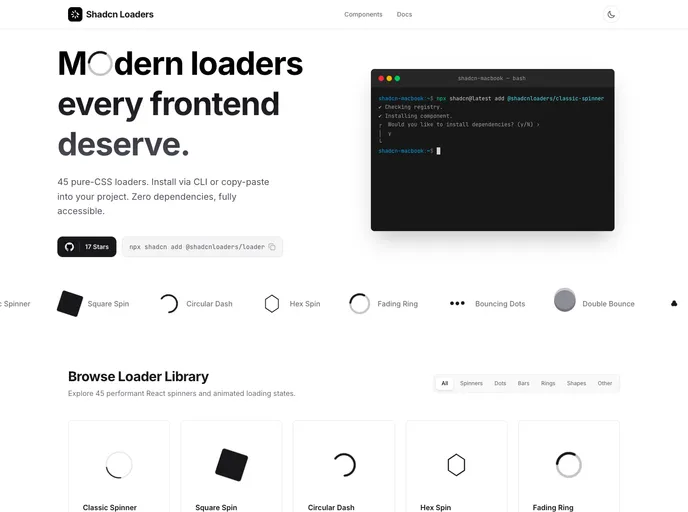
Shadcn Loaders is a public shadcn registry of animated loaders and loading states for React. The site describes 42 pure-CSS loaders and spinners with zero dependencies, each under 1KB and customizable with Tailwind CSS.
In the registry, the loaders ship as a single Loader component in loader.tsx with a variant prop that selects the animation and a size prop of sm, md, lg or xl. Keyframes for the variants that need them are bundled inside the component, colors follow Tailwind's light and dark mode classes, and a className prop allows further styling.
Features
- 42 variants: Classic spinner, dots pulse, pulse ring, bars, circular progress, wave, clock, hourglass, gear, orbit, snake and infinity
- Skeleton and text states: Skeleton, text shimmer, progress slider and glow pulse for content placeholders
- Decorative loaders: DNA, matrix, atom, solar system, radar sweep, audio wave, coffee cup, flower spin and walking steps
- One component: Every animation is reached through the
variantprop of a singleLoader - Four sizes:
sm,md,lgandxlpresets - Dark mode: Uses Tailwind
dark:classes for light and dark themes - No dependencies: Pure CSS animations with no extra npm packages
Tech stack
- React, TypeScript, Tailwind CSS
Registry
Install via the shadcn CLI registry:
npx shadcn@latest add @shadcnloaders/component-name







