


 soralabs
Soralabs
Motion-first React primitives and animated UI components for shadcn/ui. Copy, customize, and ship fluid interfaces.
- Free
- Price
- Jun 8, 2026
- Listed
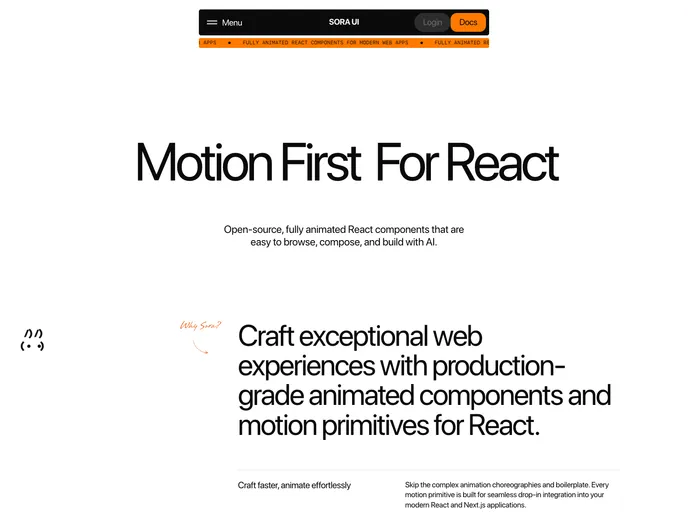 Open Soralabs
Overview
Sora UI, from Sora Labs, is an MIT-licensed registry of motion-first React components and primitives for shadcn/ui and Next.js. It is organized into four parts: unstyled motion building blocks, animated Lucide icons, a catalog of animated showcases and full layout pages, and a UI foundation that adds motion to Base UI and Radix UI components.
The registry publishes 68 items, built with Motion, GSAP and Tailwind CSS v4 on React 19, with prefers-reduced-motion support. An official MCP server built with xmcp lets AI assistants search docs and install components, and the UI registry publishes metadata on intent, accessibility constraints, motion behavior and composition rules.
Features
- Text effects: Text reveal, morph, scramble, roll, loop, typer, number flow, fog and dual-wipe reveals
- Scroll interactions: Scroll chapters, scroll gallery, sticky scroll cards and infinite scrolling images
- Interactive pieces: Magnetic cards, tilt card, cursor trail reveal, cursor bubble, particle hover and stagger buttons
- Media: Hero carousel, logo carousel swapper, pixel image loader, progressive blur and video player
- Dual primitives: Accordion, alert dialog, button, checkbox, context menu, dialog, dropdown menu, input, switch and tooltip in both Base UI and Radix UI versions
- Hooks: Auto height, controlled state and prefers-reduced-motion hooks
- MCP server: Search, browse and install from Cursor, Claude Desktop or Claude Code
Tech stack
- React 19, Next.js, Tailwind CSS v4
- Motion, GSAP, Lenis
- Base UI, Radix UI
Registry
Install via the shadcn CLI registry:
npx shadcn@latest add @soralabs/component-name







