


 spell
Spell UI
Spell UI is a collection of beautiful, sophisticated UI components tailored for modern React and Tailwind CSS applications, specifically designed for developers and design engineers.
- Free
- Price
- Mar 28, 2026
- Listed
 Open Spell UI
Overview
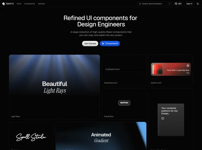
Spell UI is an MIT-licensed collection of copy-and-paste React components for Tailwind CSS projects, pitched as "refined UI components for Design Engineers." The project by xxtomm has about 1,360 GitHub stars and documentation at spell.sh, along with an MCP page and a Discord community.
The registry publishes 33 components that lean toward animated details and visual polish rather than form primitives. Highlights on the site include Light Rays, Perspective Book, Exploding Input, Spotify Card, Pop Button, Signature and Animated Gradient. A handful of components use Motion, Three.js or opentype.js for their effects.
Features
- Text effects: Blur reveal, shimmer, highlighted, special, randomized, slide-up, gradient wave text and words stagger
- Buttons and inputs: Rich, flow and pop buttons, copy button, label input and exploding input
- Showcase cards: Perspective book, tilt card, Spotify card and embedded tweet
- Backgrounds: Light rays and animated gradient
- Utilities: Kbd, spinners, badge, color selector, chart, QR code and fallback avatar
- Signature: A signature component featured on the homepage
- Marquees: Text marquee, marquee and logos carousel
Tech stack
- React, Tailwind CSS
- Motion, Radix Slot, class-variance-authority
- Three.js, opentype.js
Registry
Install via the shadcn CLI registry:
npx shadcn@latest add @spell/component-name







