


 swiftui-flx
Swiftui Flx
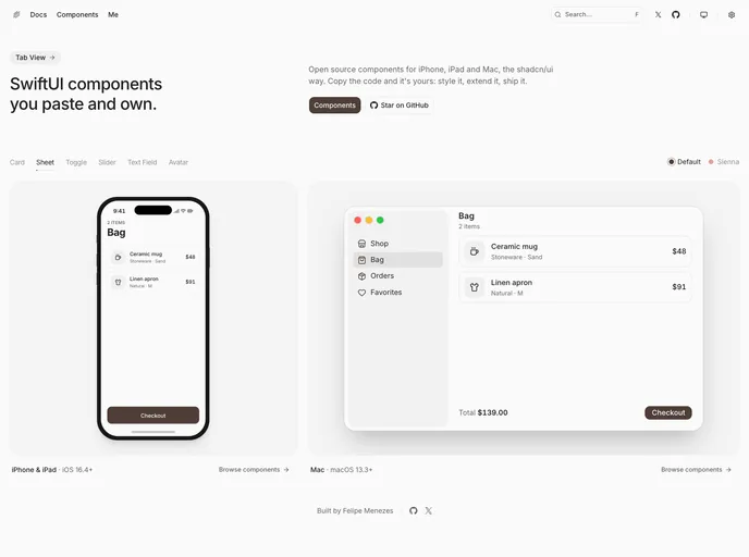
SwiftUI components for iPhone, iPad and Mac, the shadcn/ui way. Native controls, design tokens, themes and dark mode. Install with the shadcn CLI and own the Swift code.
- Free
- Price
- Oct 6, 2026
- Listed
 Open Swiftui Flx
Overview
swiftui-flx is an open-source set of SwiftUI components for iPhone, iPad and Mac, distributed the shadcn/ui way: the Swift source is copied into the app and can be restyled or extended freely. It is built by Felipe Menezes and installs through the shadcn CLI.
The registry has 36 files: a shared foundation file with design tokens, a Sienna theme preset, and paired iOS and macOS versions of each component. The iOS components target iOS 16.4+ and the Mac components target macOS 13.3+. The docs preview components inside a sample music app, with a toggle between the default and Sienna themes and support for dark mode.
Features
- Paired platforms: Separate
ios-andmac-versions of button, card, avatar, badge, item, empty state, slider and toggle. - Form controls: Text field, text field group, secure field, text editor, field label and form field.
- Menus and pickers: An iOS menu and picker plus progress views for both platforms.
- Collapsible: Expandable sections for iOS and macOS.
- Design tokens: A foundation file that holds shared tokens used by every component.
- Themes: A default theme and a Sienna preset, with dark mode support.
Tech stack
- Swift, SwiftUI
- iOS 16.4+, iPadOS, macOS 13.3+
- shadcn CLI for distribution
Registry
Install via the shadcn CLI registry:
npx shadcn@latest add @swiftui-flx/component-name







