


 tile-ui
Tile UI
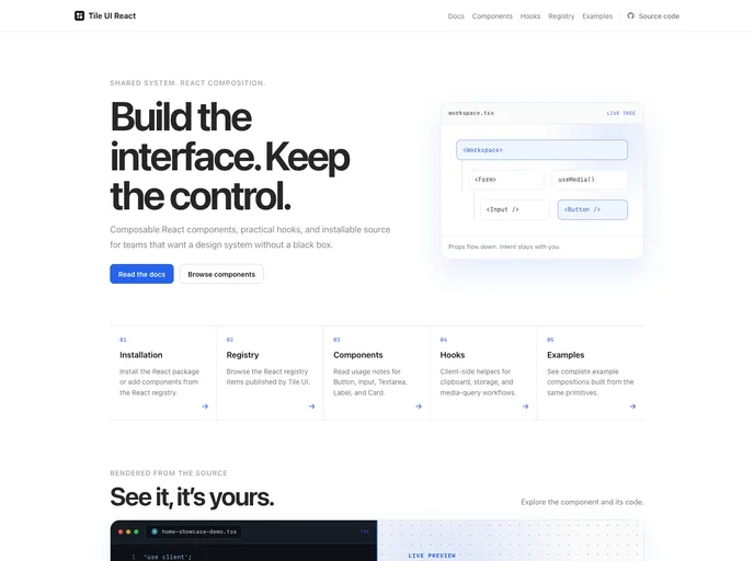
A lightweight React component library built around a shared SCSS design system and distributed as editable source through the shadcn CLI.
- Free
- Price
- Sep 12, 2026
- Listed
 Open Tile UI
Overview
Tile UI is a lightweight, cross-framework component library built around a shared SCSS design system, with separate packages for React, Vue and SolidJS and a shadcn-style registry for each. This listing covers Tile UI React, whose registry lists 72 items: 62 UI components, three hooks, two themes (default and Kumo), a base style and shared lib files.
The project aims to offer a cleaner styling workflow than long utility class strings while keeping registry-based distribution. Components can be installed as the @tile-ui/react package with @tile-ui/styles and @tile-ui/core, or added as editable source through the shadcn CLI. The README notes the project is still being actively built out and welcomes contributions.
Features
- Shared SCSS design system: Global styles, variables and mixins live in
@tile-ui/stylesand are shared by every framework package. - Broad component set: Button, input group, field, form, select, combobox, command, dialog, sheet, drawer, sidebar, chart, calendar, carousel and more.
- Chat components: Attachment, bubble, message and message scroller for chat interfaces.
- Hooks:
use-copy-to-clipboard,use-media-queryanduse-local-storage. - Themes: A default theme and a Kumo theme as registry items.
- Docs per framework: Installation, registry, components, hooks and examples pages, with the React docs built on Next.js and Fumadocs.
Tech stack
- React, SCSS, Radix UI Slot
- Next.js App Router with fumadocs-mdx for the docs site
- Sibling Vue (Nuxt) and SolidJS (SolidStart) packages
Registry
Install via the shadcn CLI registry:
npx shadcn@latest add @tile-ui/component-name







