


 tweenly
Tweenly
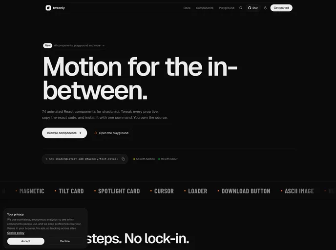
Animated React components built on Motion and GSAP. Tweak every prop live, copy the code, and own it.
- Free
- Price
- Sep 28, 2026
- Listed
 Open Tweenly
Overview
tweenly describes itself as the motion layer for shadcn/ui: 74 animated React components that can be tweaked live in a playground, copied with the exact props chosen, and installed with one shadcn CLI command. According to the site, 58 components use Motion and 18 use GSAP, and the registry also ships a reduced-motion hook, a font and a theme.
The set spans text effects, buttons, scroll interactions, galleries, form controls, a chart kit, page-level pieces such as preloaders and page transitions, and a newer group of AI components. Smooth scrolling uses Lenis.
Features
- Text effects: Fade in, text reveal, typewriter, word rotate, shimmer text, number ticker and scroll text reveal.
- Buttons: Fill, shine, ripple, hold, slide, like and download buttons, plus a magnetic wrapper.
- Scroll and gallery: Horizontal scroll, sticky cards, image reveal, image fan, image arc, expand gallery and curved carousel.
- Form controls: Segmented control, number stepper, elastic switch, expand input, rating and OTP input.
- Charts: Line, bar, radial, rings, radar, KPI, heatmap, progress and dots charts.
- Page pieces: Navbar, table of contents, footer, FAQ, preloader, page loader, page transition, 404 and sign in / sign up.
- AI components: AI input, AI recorder, AI voice and AI thinking.
- Live playground: Every prop can be adjusted live before copying the code.
Tech stack
- React, shadcn/ui, Tailwind CSS
- Motion, GSAP with @gsap/react, Lenis, lucide-react
Registry
Install via the shadcn CLI registry:
npx shadcn@latest add @tweenly/component-name







