


 velobits
VeloBits UI
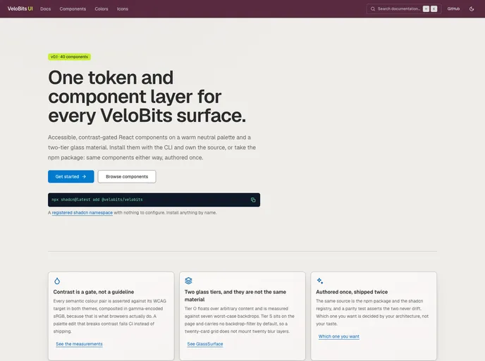
An open source collection of accessible, contrast-gated React components on a warm neutral palette and a two-tier glass material — the VeloBits design system, authored once and shipped both as an npm package and as this registry.
- Free
- Price
- Aug 17, 2026
- Listed
 Open VeloBits UI
Overview
VeloBits UI is the open-source token, icon and component layer shared across every VeloBits product. It provides accessible React components on a warm neutral palette with a two-tier glass material, currently at v0.1 with 40 components: 20 primitives, 6 overlays and 14 composites.
The same source is published both as an npm package and as a registered shadcn namespace, and a parity test checks that the two never drift. Contrast is enforced in CI: every semantic color pair is asserted against its WCAG target in both themes, composited in gamma-encoded sRGB, so a palette edit that breaks contrast fails the build.
Features
- Contrast-gated palette: WCAG checks run on every semantic color pair in light and dark themes.
- Two glass tiers: Tier O floats over content and is tested against seven worst-case backdrops; Tier S has no backdrop-filter by default.
- GlassSurface: One component exposes the surface, overlay and elevated tiers through a single prop.
- DataTable: Sorting, selection and row activation over a column registry, without TanStack Table.
- App chrome: AppShell, a cmdk-based CommandPalette in a Radix Dialog, side panel, breadcrumb and tabs.
- Composites: Code block, diff viewer, empty state, form, pagination, segmented control and status chip.
- Motion: Page transitions and capped list staggers on framer-motion.
- Dual distribution: Install by name with the shadcn CLI or use the npm package.
Tech stack
- React
- Radix UI, cmdk
- framer-motion
- shadcn registry and npm package
Registry
Install via the shadcn CLI registry:
npx shadcn@latest add @velobits/component-name







