


 bricked
Bricked UI
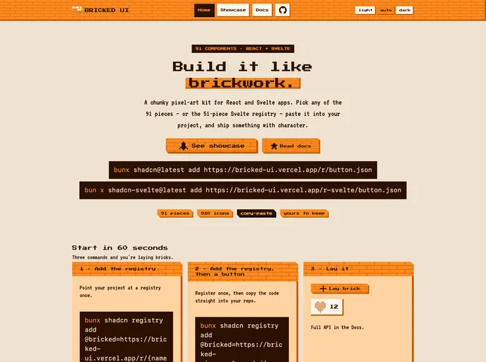
A chunky pixel-art kit for React and Svelte apps. Pick any of the 91 pieces.
- Free
- Price
- Oct 19, 2026
- Listed
 Open Bricked UI
Overview
Bricked UI is a pixel-art component kit for React and Svelte apps, installed with the shadcn CLI. Its visual language is orange bricks, hard bevels and cut corners. The site describes 90+ pieces, and the registry serves 93 items, including a global stylesheet and CSS layer.
The kit covers standard interface parts such as dialogs, data tables and sidebars, alongside playful pieces like dice, coin flips, a fortune widget and a wall builder. It also bundles 930 pixel icons as SVG paths, including 7x7 grids, 16x16 brand marks and the 42x42 Streamline Pixel set under CC BY 4.0.
Features
- Pixel icon set: 930 SVG icons in several grid sizes.
- Core components: Buttons with icon-button variants, inputs, selects, checkboxes, radios, switches, sliders and OTP input.
- Overlays and navigation: Dialog, alert dialog, drawer, sheet, popover, command palette, menubar, sidebar and pagination.
- Data and status: Data table, stat card, pixel bar chart, progress, health meter, leaderboard and timeline.
- Messaging: Chat bubbles, message lists, message scroller and toast.
- Playful extras: Dice, coin flip, fortune, counter, countdown, live clock, keycap and launch pad.
- Variants: Most components use class-variance-authority with orange and dark options.
Tech stack
- React and Svelte
- Tailwind CSS, class-variance-authority
- shadcn CLI registry
Registry
Install via the shadcn CLI registry:
npx shadcn@latest add @bricked/component-name







