 chakra-ui
Ark UI
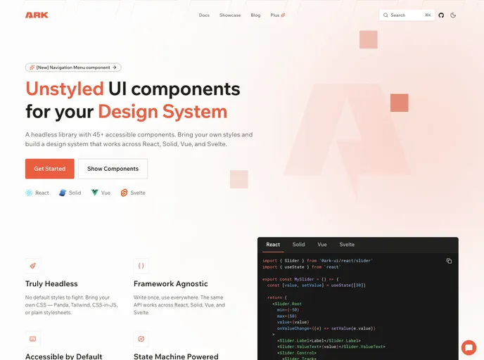
A headless library of 45+ unstyled, accessible components powered by state machines, with the same API across React, Solid, Vue and Svelte.
- 5.4k
- GitHub stars
- Free
- Price
- Oct 26, 2026
- Updated
 Open Ark UI
Overview
Ark UI is a headless component library from the Chakra UI team with 45+ unstyled, accessible components for building a design system. It ships no default styles, so components can be styled with Panda CSS, Tailwind CSS, CSS-in-JS or plain stylesheets.
Every component is driven by Zag.js state machines, which keeps complex interactions predictable and lets the same API work across React, Solid, Vue and Svelte. WAI-ARIA patterns, keyboard navigation and screen reader support are built in. Several shadcn-style libraries, such as ARK CN, are built on top of it.
Features
- 45+ components: Including combobox, date picker, slider, menu, navigation menu, tabs and toast
- Truly headless: No default styles to override
- Framework agnostic: One API across React, Solid, Vue and Svelte
- Accessible by default: WAI-ARIA patterns, keyboard navigation and screen reader support
- State machine powered: Behavior built on Zag.js state machines
- MIT licensed: Free and open source
Tech stack
- React, Solid, Vue, Svelte
- Zag.js, TypeScript
Getting started
npm install @ark-ui/react