 react-aria
React Aria
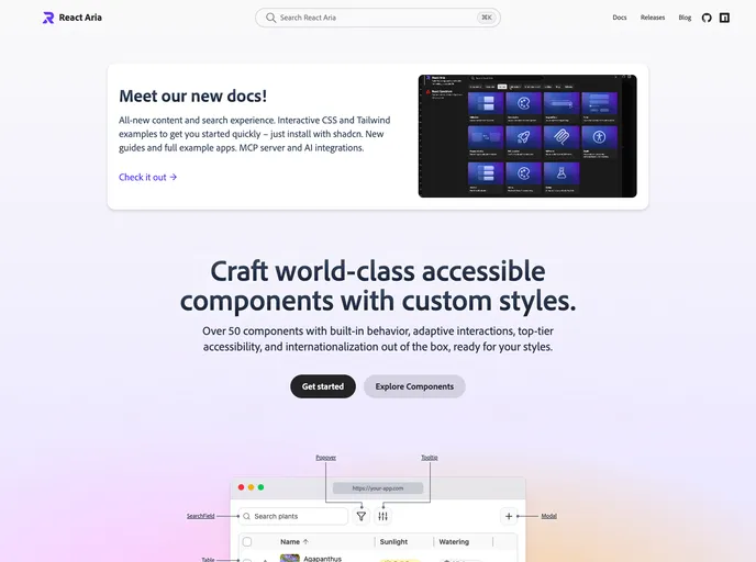
Craft world-class accessible React components with custom styles — 50+ primitives with adaptive interactions, i18n, and shadcn-installable examples on the new docs.
- 15.1k
- GitHub stars
- Free
- Price
- Jan 1, 2026
- Updated
 Open React Aria
Overview
React Aria is Adobe's library of unstyled React components and hooks for building accessible, high-quality UI for an application or design system. It offers more than 50 components with built-in behavior, adaptive mouse, touch and keyboard interactions, and internationalization. It is part of the React Spectrum project alongside React Spectrum, React Stately and the Internationalized packages.
Components ship without styles and are broken into individual parts with built-in states, render props, slots and data attributes, so they can be styled with vanilla CSS, Tailwind, Styled Components, Panda or any other approach. The docs provide CSS and Tailwind example code that can be copied, downloaded as a ZIP, opened in StackBlitz or installed with the shadcn CLI, plus Storybook starter kits and an MCP server.
Features
- Accessibility: Behavior follows the WAI-ARIA Authoring Practices, with screen reader and keyboard support tested across many devices.
- Adaptive interactions: Every component handles mouse, touch and keyboard input.
- Internationalization: Over 30 languages, right-to-left layouts, and date and number formatting.
- Broad component set: Tables, trees, date and range pickers, color pickers, combo boxes, drop zones, toasts, token fields and virtualized collections.
- Style-free parts: Render props, slots and data attributes such as
data-pressedanddata-selectedfor styling states. - shadcn install: Example code, styles and dependencies install with
npx shadcn@latest add @react-aria/cssor per component. - Starter kits: Storybook starter kits with every component for building a full library.
Tech stack
- React, TypeScript, React Stately,
@internationalizedpackages - Styling with vanilla CSS or Tailwind CSS
Getting started
npm install react-aria-components