 karaui
Kara UI
Animated React components, AI agent interfaces and app blocks built with Motion and Tailwind CSS, with ten switchable design styles.
- Free
- Price
- Oct 19, 2026
- Listed
 Open Kara UI
Overview
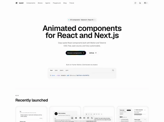
Kara UI is a free, open-source library of animated components for React and Next.js, built with Motion and Tailwind CSS and distributed through the shadcn registry. Now at v2, it targets Tailwind 4 and React 19, and each component page has a live preview, usage example, source code and install command. It is MIT licensed and built on beUI by Saurabh Chauhan as its base project.
The registry lists 213 items: 145 components and 68 blocks. Alongside animated inputs, menus and text effects, it has a set of AI agent interface components such as a model picker, context meter, message actions and a voice-mode orb. Agents can read static endpoints like llms.txt and /r/{slug}.json, and a Kara UI skill is available.
Features
- Animated primitives: Accordion, collapsible, tabs, switch, select, combobox, checkbox, menubar, toggle group and badge with spring motion.
- Buttons: Magnetic, stateful, hold action, slide action and expanding arrow buttons.
- Text and numbers: Text scramble, text reveal, chromatic text reveal, text shimmer, text cascade, number ticker and animated number.
- AI interfaces: Model selector, context meter, prompt suggestions, message actions, branch navigator, conversation history, artifact canvas and a voice orb.
- Mobile patterns: Bottom sheet, pull to refresh, swipe rows, an iOS-style island pill and a macOS-style dock.
- Charts: Animated SVG area, line, bar, donut and pie charts with no chart library dependency.
- Agent skill:
npx skills add kamisama-v0/Karaui --skill karaui.
Tech stack
- React 19, Next.js
- Tailwind CSS v4
- Motion
Registry
Install via the shadcn CLI registry:
npx shadcn@latest add @karaui/component-name