 visant
Visant UI
Brand-aware React components, blocks and app kits from Visant Labs: tokens, motion and analog-sound feedback that dress in your brand.
- Free
- Price
- Oct 22, 2026
- Listed
 Open Visant UI
Overview
Visant UI (@visant/ui) is the React component library from Visant Labs, published as a shadcn registry with 147 items. Its premise is brand-awareness: a brand theme provider applies a compiled brand guideline at runtime, and a brand selector previews palette, type pairing and completeness, so each component takes on whichever brand is chosen. The site and component descriptions are written in Portuguese.
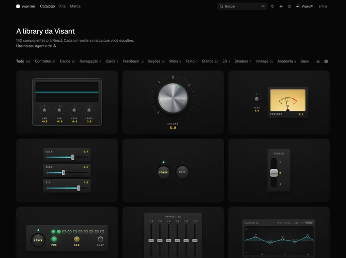
The registry mixes 122 UI components with libraries, hooks and blocks. It includes a vintage audio-panel kit with its own theme, motion helpers built on GSAP, ScrollTrigger and Lenis that bail out under reduced motion, and an analog sound layer that synthesizes clicks in pure WebAudio with no audio files.
Features
- Brand theming: Runtime brand theme provider and hook plus a brand selector with live preview.
- Vintage kit: Knobs, faders, VU meter, parametric EQ, LEDs, XY pad, oscilloscope and soundboard pads.
- Sound feedback: An SFX bus of analog object clicks in WebAudio and an animated sound toggle.
- Motion: GSAP marquee, smooth scroll provider, fold entrance hierarchy, line reveals, pinned scenes and pointer parallax.
- App components: Kanban with drag and marquee selection, dense data table, inline edit, side nav, auth button and profile form.
- Blocks: Kanban, step cards, testimonial wall, fog hero and fog garden.
- Interactive pieces: Dynamic island, hold-to-confirm, slide-to-confirm, signature pad, sticker peel and six shader effects.
- Agent rules: A registry item with rules for AI coding agents.
Tech stack
- React, Motion
- GSAP, ScrollTrigger, Lenis
- WebAudio, WebGL
- shadcn registry
Registry
Install via the shadcn CLI registry:
npx shadcn@latest add @visant/component-name