Shadcncraft Figma Kit
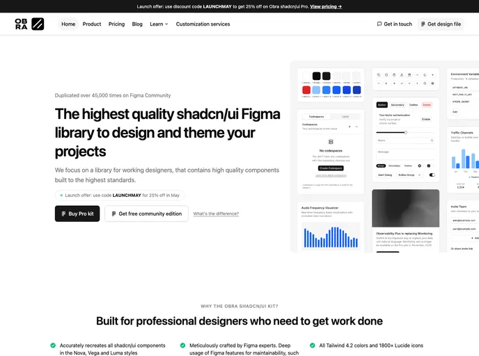
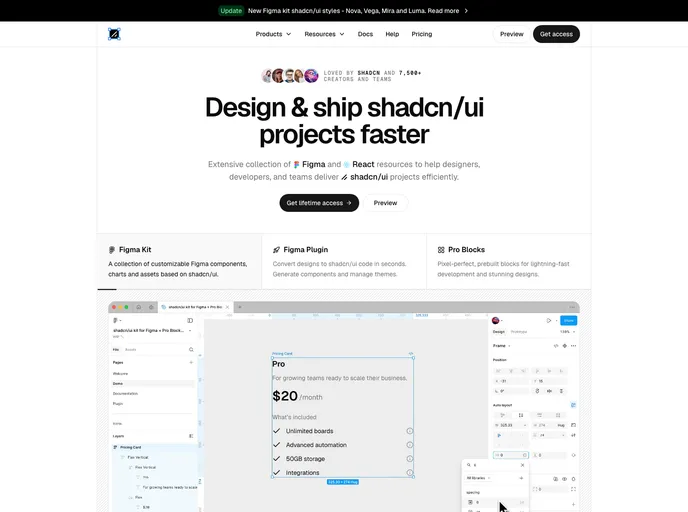
Complete shadcn/ui Figma kit with all seven native shadcn styles, shadcn Create and tweakcn imports, style-linked icons, and 1:1 parity with shadcn code.
- $299
- Price
- May 27, 2026
- Listed
 Open Shadcncraft Figma Kit
Overview
The shadcncraft Figma Kit is a shadcn/ui UI kit for Figma in which all eight official shadcn styles (Nova, Vega, Maia, Mira, Luma, Lyra, Sera and Rhea) live natively as Figma variable modes. Designers switch styles from the variables panel without a plugin, and every component is matched 1:1 with shadcn/ui in code.
The kit comes in four bundles: a free starter with a curated sample, Base Figma with the official shadcn component and block set, Pro Figma with Pro application, marketing and ecommerce components, blocks and pages, and Pro Figma + React, which adds matching React code, code export from Figma and CLI install commands. A companion Figma plugin imports presets from shadcn Create and themes from tweakcn.
Features
- Eight native styles: Per-component spacing, typography, color, radius and icon set recreated for each style through Figma variables
- Custom styles: Create new shadcn-aligned styles by adjusting radius, colors, fonts and icons in the same variable system
- shadcn Create import: Paste a Create preset URL into the shadcncraft plugin for a 1:1 recreation in Figma
- tweakcn themes: Layer a tweakcn theme over any of the eight styles, in light and dark
- Icon switching: Lucide, Tabler Icons, Hugeicons, Phosphor Icons and Remix Icon follow the selected style
- Example layouts: AI Chat app, ClearFlow website and a sales and marketing dashboard in the Pro bundles
- React parity: Components align with the free shadcncraft React registry, with code export in the Pro Figma + React bundle
Tech stack
- Figma variables, shadcn/ui, React, Tailwind CSS