



 Shadcn Space
Shadcnspace Figma Kit
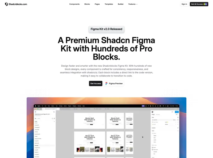
Premium shadcn/ui Figma kit with 257+ pro blocks, full component library, light/dark themes, and direct code mapping aligned with Shadcnspace React UI.
- Free
- Price
- May 27, 2026
- Listed
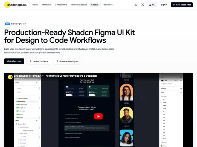 Open Shadcnspace Figma Kit
Overview
The Shadcn Space Figma UI Kit (v1.1) is a Figma design kit structured around shadcn/ui, built so that designs match how the components are implemented in code. It includes every base shadcn/ui component, 521+ desktop and mobile blocks, and a theme system with light and dark modes and tokens aligned with shadcn/ui. A free Figma file can be downloaded alongside a Pro version offered through Shadcn Space's all-access plan.
The kit mirrors the Shadcn Space code library, whose components and templates are built with Base UI and Radix UI. Variable names map 1:1 to shadcn/ui tokens, removing the translation layer between design and code, and every block keeps its responsive breakpoints in a single file.
Features
- All base components: Every shadcn/ui component available in Figma
- 200+ component variants: Consistent naming and variant structure across states
- 521+ blocks: Hero, pricing, feature, navbar, testimonial, footer, newsletter, portfolio, AI ops, dashboard shell, chart, widget, sidebar, login, dialog and compare sections
- 1:1 variable mapping: Figma variable names match shadcn/ui tokens exactly
- Responsive in one file: 1440px desktop and 375px mobile views per block
- Light and dark mode: Theming aligned with the design tokens used in the codebase
- Drag and drop builder: Assemble marketing pages visually and copy the resulting React code
Tech stack
- Figma, shadcn/ui tokens, React, Base UI, Radix UI