


 svelte-bits
Svelte Bits
An open source collection of high quality, animated, interactive & fully customizable Svelte components for building stunning, memorable user interfaces.
- Free
- Price
- Jul 2, 2026
- Listed
 Open Svelte Bits
Overview
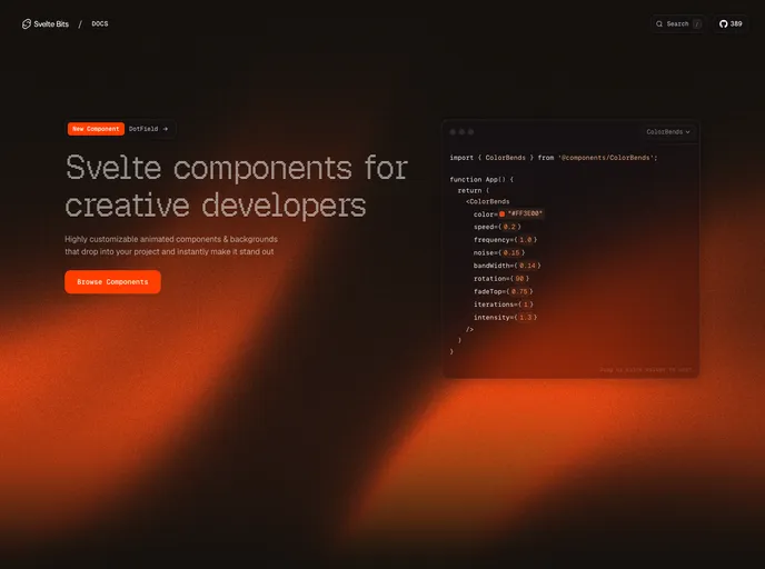
Svelte Bits is an open-source collection of animated, interactive Svelte components and backgrounds, built as a Svelte port of React Bits by David Haz. The site advertises 130+ components and its registry currently lists 164 items, organized into four categories: backgrounds, text animations, animations and UI components.
Every component ships as a typed Svelte 5 component styled with Tailwind CSS, and props can be edited live in the docs before copying. Components install into a project's own codebase with either jsrepo or the shadcn CLI. Heavier effects rely on GSAP, Motion, OGL or Three.js, and the project is free to use.
Features
- Backgrounds: Aurora, Balatro, Beams, Dither, Galaxy, Hyperspeed, Liquid Chrome, Plasma, Prism, Radar, Shape Grid and more.
- Cursor and hover effects: Blob cursor, splash cursor, target cursor, ghost cursor, click spark, glare hover and image trail.
- Animations: Antigravity, Ballpit, Magic Rings, Metallic Paint, Pixel Transition, Sticker Peel and Electric Border.
- Text animations: Effects such as Shiny Text and Letter Glitch.
- UI components: Interactive patterns such as Dock.
- Live prop editor: Values in the docs examples can be dragged or clicked to edit before copying.
- Two install paths:
npx jsrepo add https://sveltebits.xyz/r/aurora.jsonor the shadcn CLI.
Tech stack
- Svelte 5, TypeScript, Tailwind CSS
- GSAP, Motion, OGL, Three.js, postprocessing, matter-js
Registry
Install via the shadcn CLI registry:
npx shadcn@latest add @svelte-bits/component-name







