arihantcodes
Spectrum UI
Spectrum UI is a collection of re-usable components built using Aceternity UI Magic UI and ShadCN UI that you can copy and paste into your apps.
- 377
- GitHub stars
- Free
- Price
- May 19, 2025
- Updated
 Open Spectrum UI
Overview
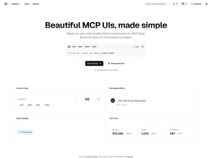
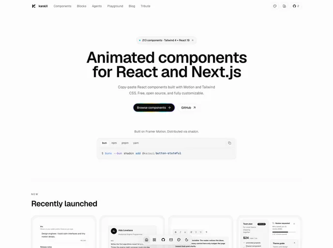
Spectrum UI is a free, open-source collection of animated React components built on shadcn/ui, Tailwind CSS and Motion, made by Arihant and contributors. Nothing sits behind a package: the source lands in the project and can be changed freely. The docs list 250+ components plus page blocks and a few full templates, each with a live preview and its code underneath.
Components can be copied from the site, installed with the shadcn CLI, or added by an AI editor through the Spectrum UI MCP server, which lets Claude Code, Cursor or Windsurf browse and install components on request. The project is licensed under Apache 2.0 and is part of the Vercel OSS program.
Features
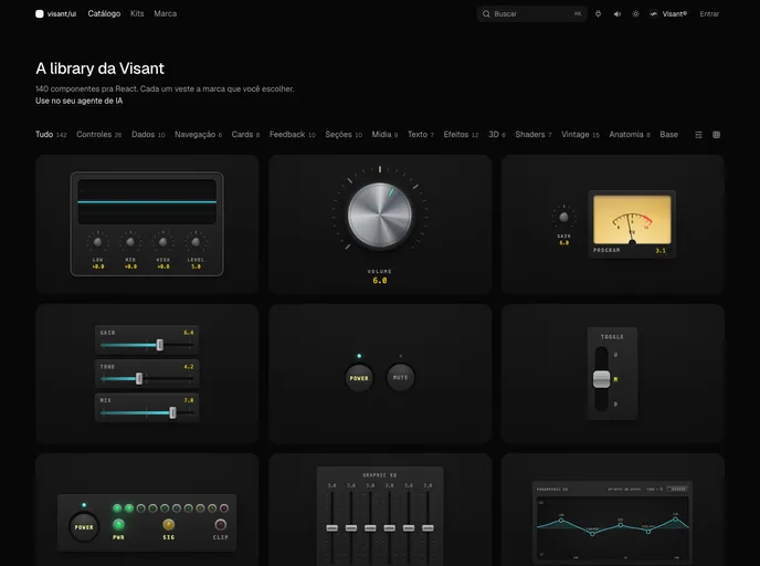
- 250+ components: Forms, cards, buttons, ratings, overlays, media, auth and feedback components.
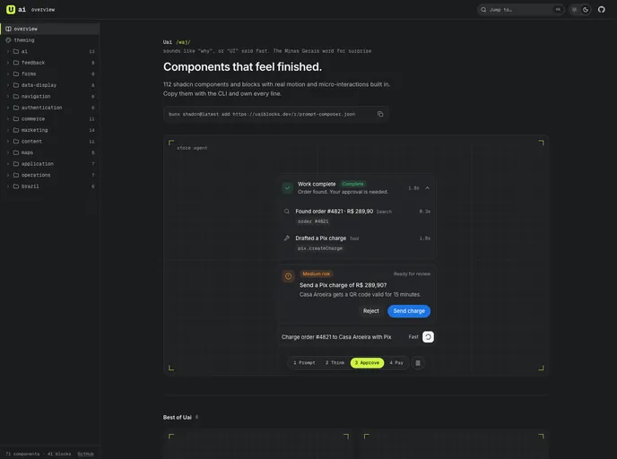
- AI interface pieces: Agent plan and steps, approval card, prompt composer, model selector, reasoning trace, citation sources and diff view.
- Inputs: Datetime picker, dual range slider, floating label input, autosize textarea and inline edit.
- Blocks: Hero, pricing, FAQ, CTA and footer sections, including animated footers.
- Templates: Dashboards and landing pages that can be reused wholesale.
- MCP server: Install with
claude mcp add spectrum-ui -- npx -y @spectrumui/mcp. - Colors: A palette browser at /colors.
Tech stack
- Next.js 14 (App Router), TypeScript
- Tailwind CSS, Radix UI, shadcn/ui
- Motion (Framer Motion), Recharts
Registry
Install via the shadcn CLI registry:
npx shadcn@latest add @spectrumui/component-name